burton
DESIGN
Branding, Packaging, Apparel
TYPE
University project
DELIVERABLES
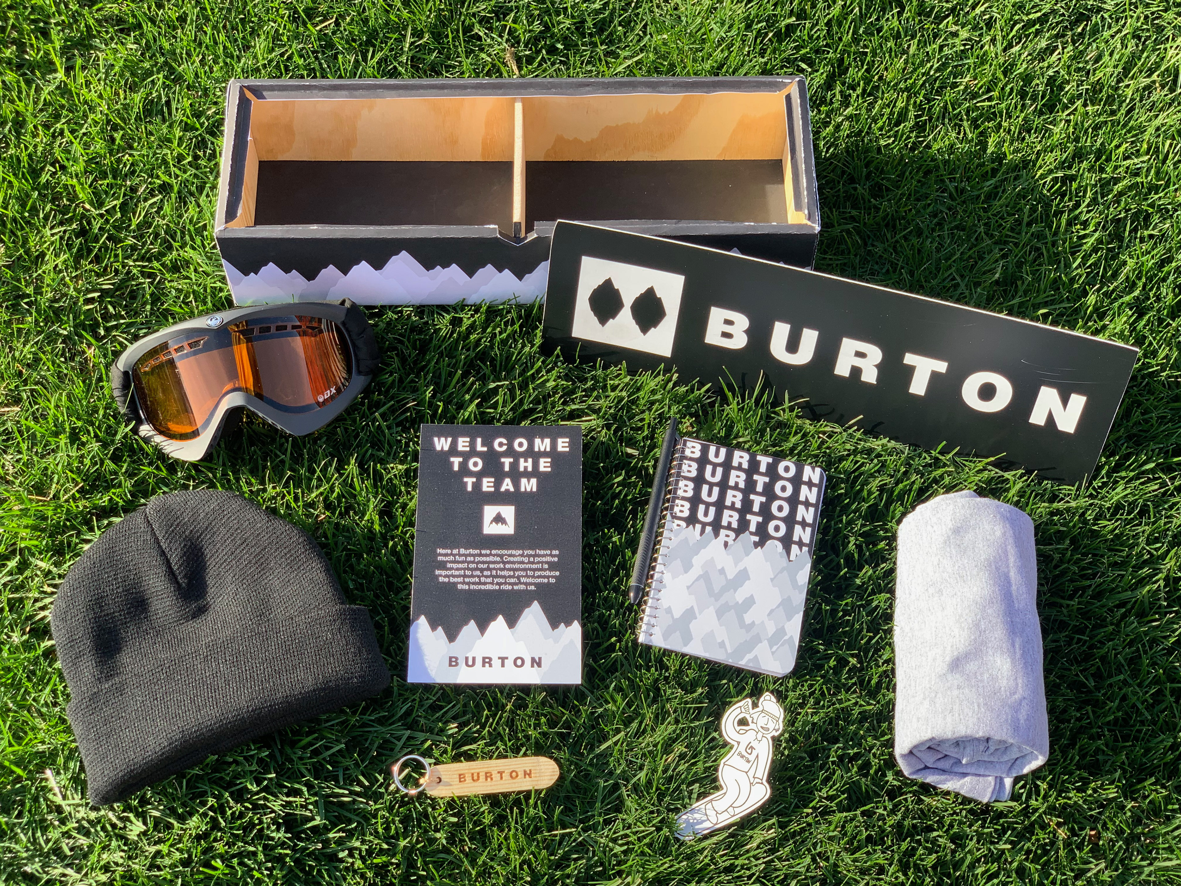
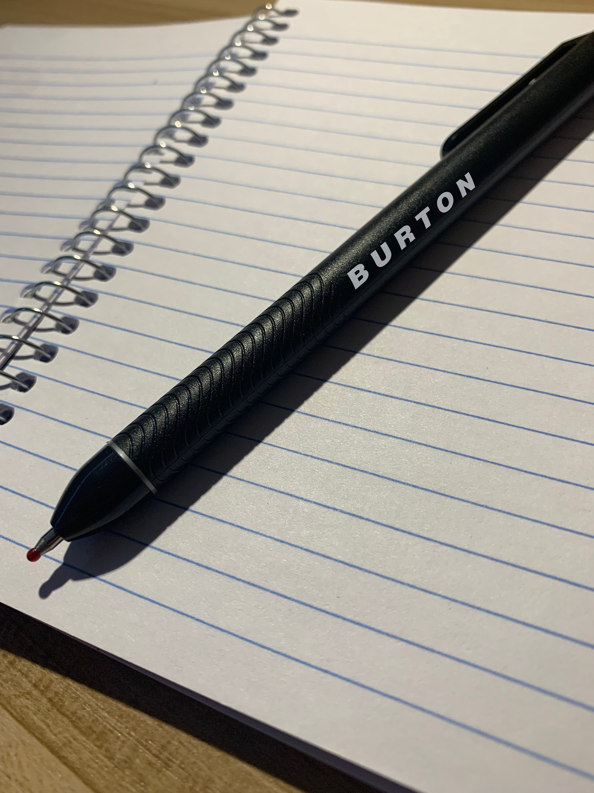
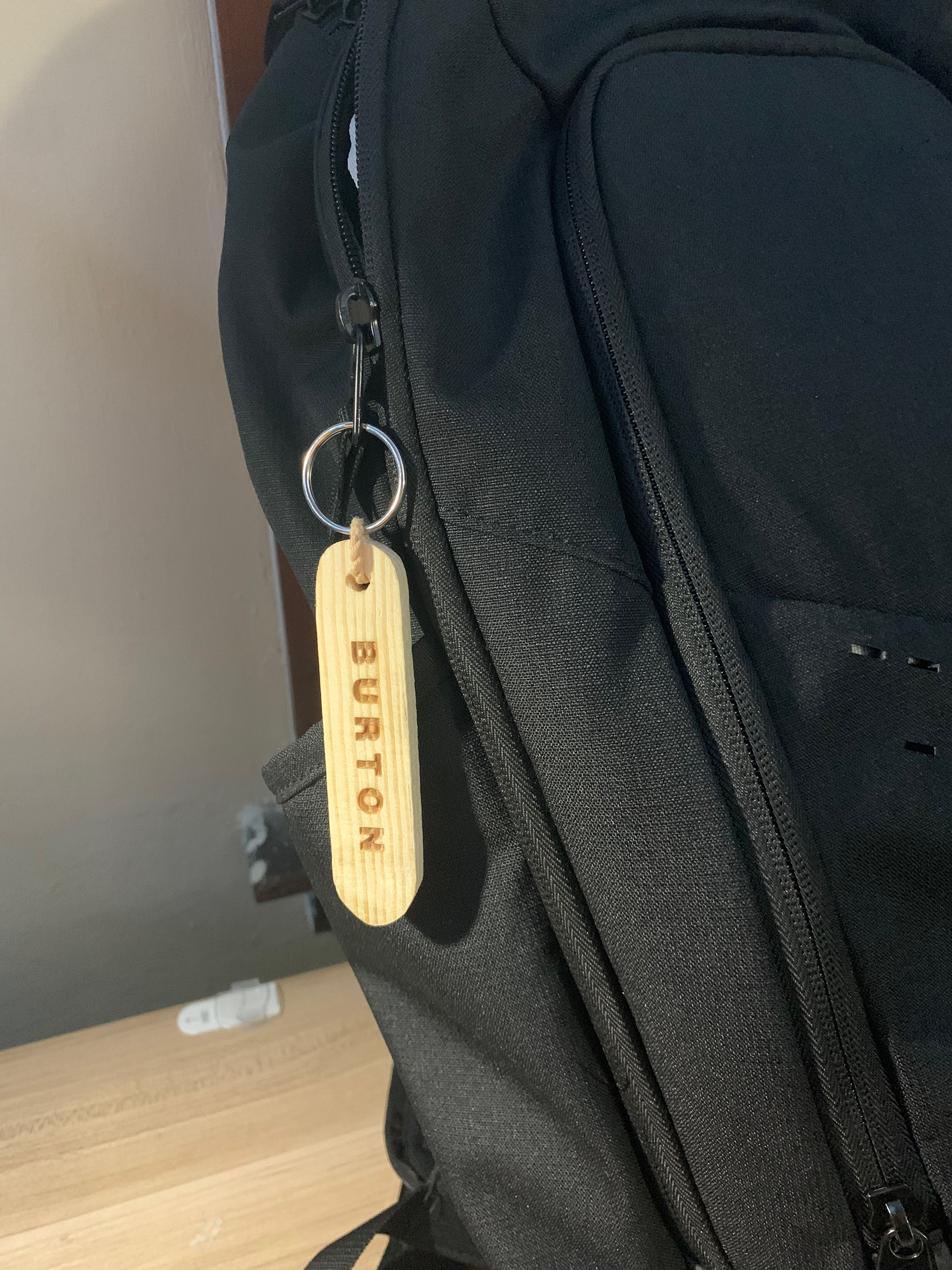
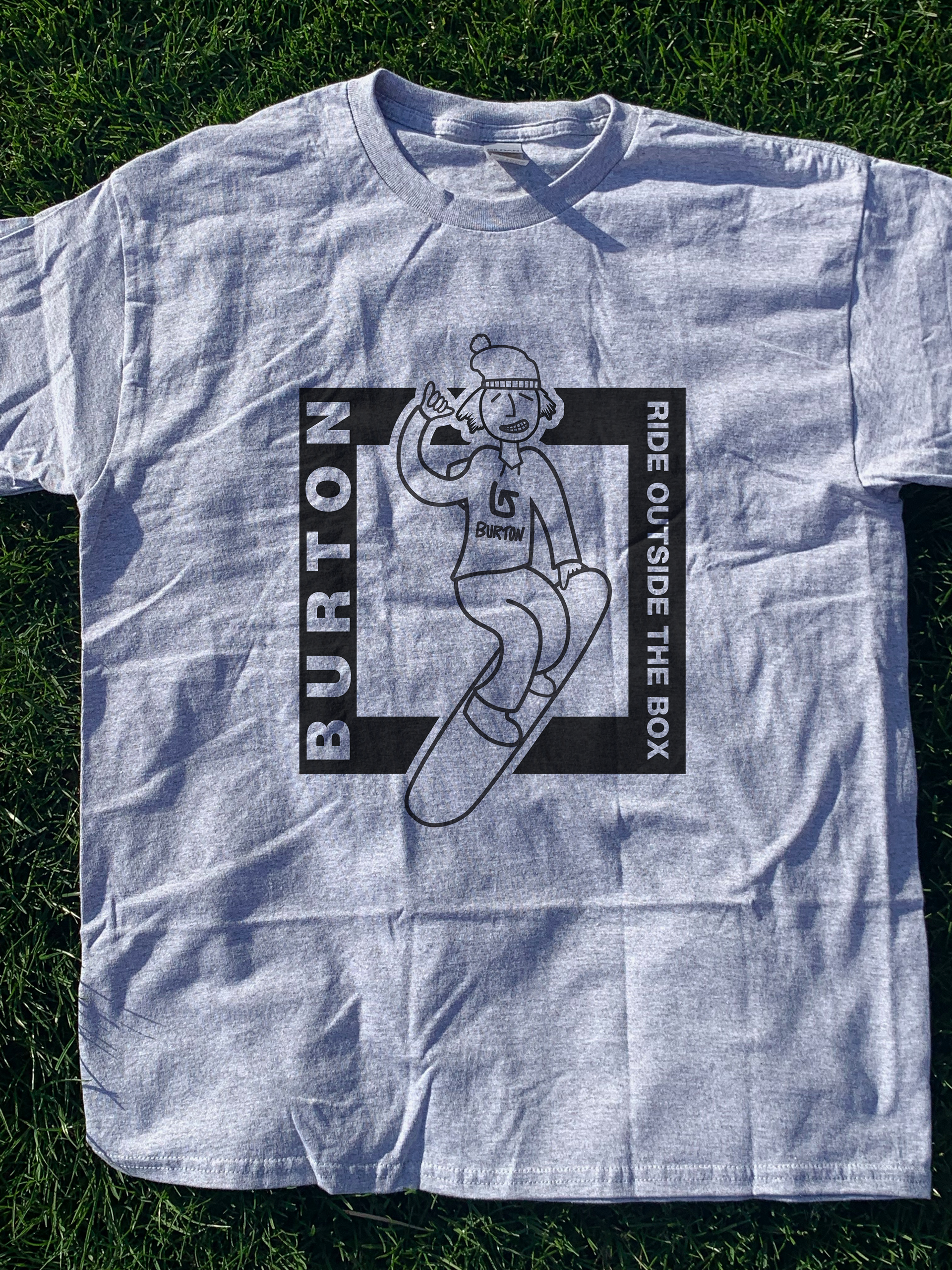
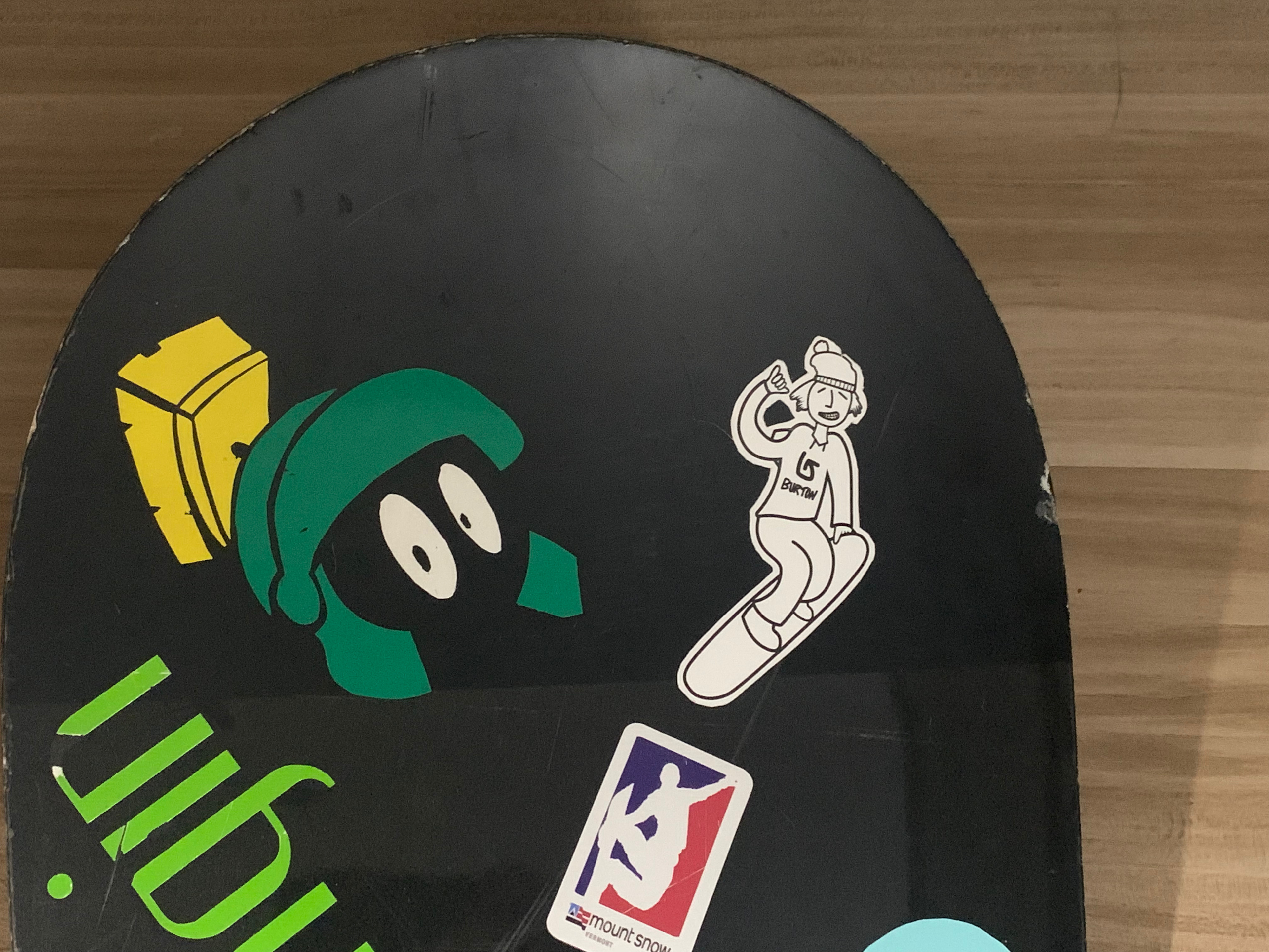
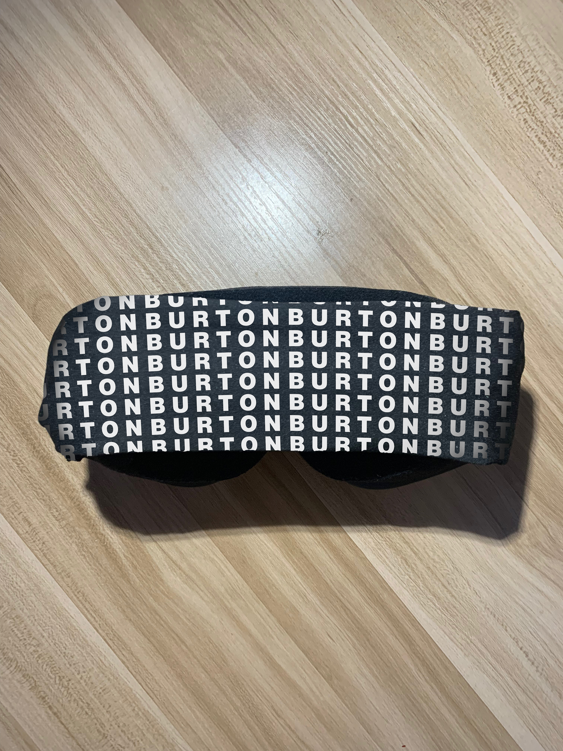
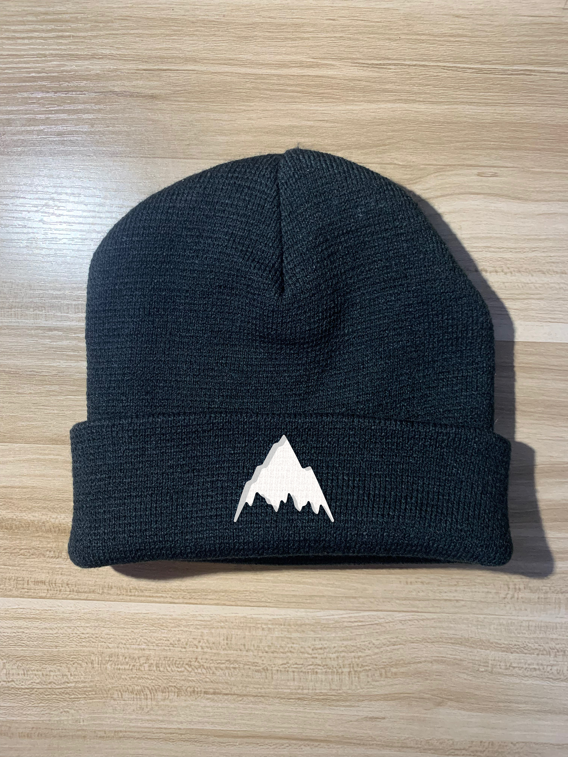
Welcome package box, Trail sign decoration, Welcome note, Shirt, Beanie, Snow goggles, Notebook & pen, Keychain, Sticker
THE IDEA
A welcome package for the company of our choice (Burton Snowboards) to send new employees
BRANDING
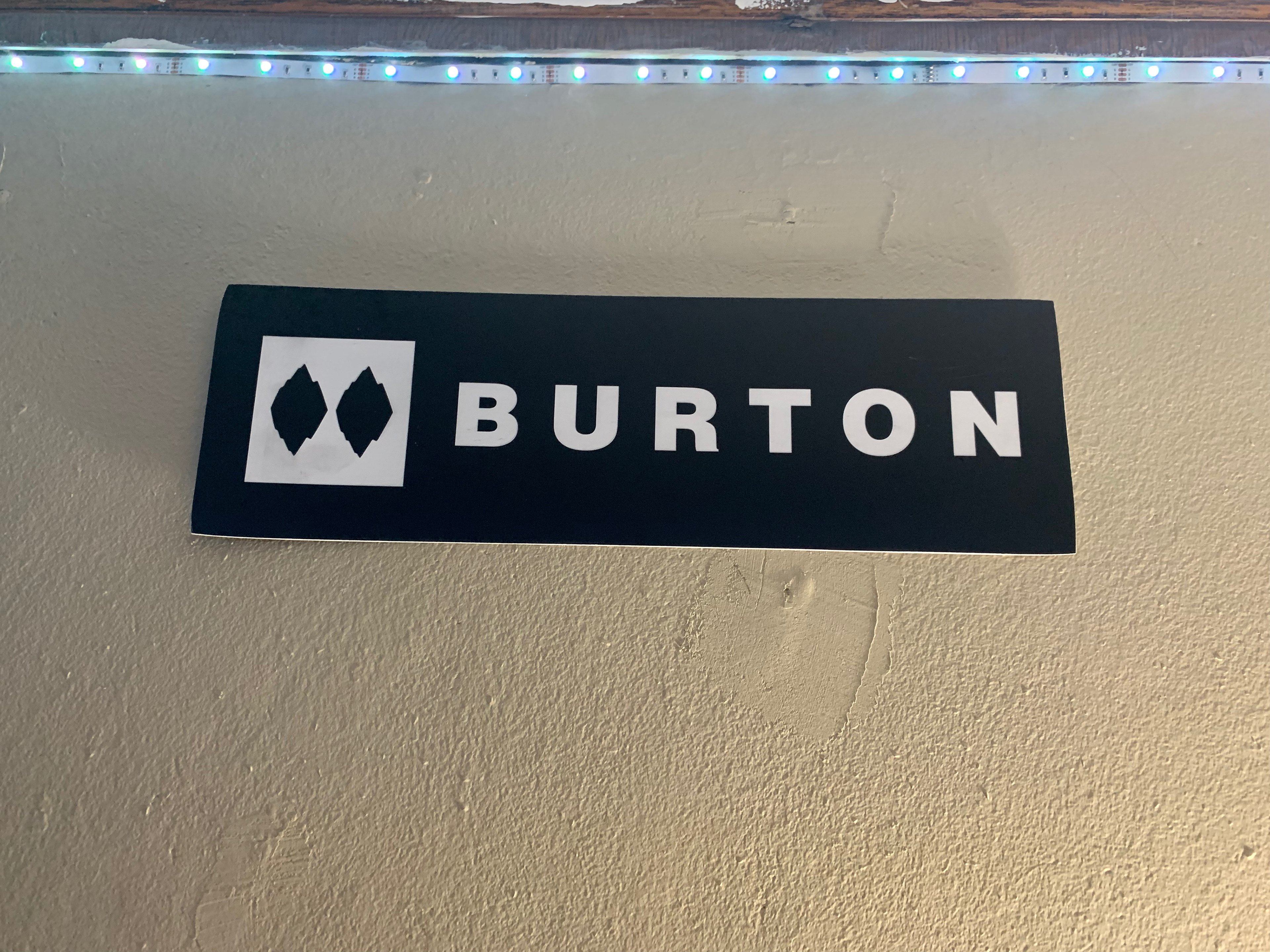
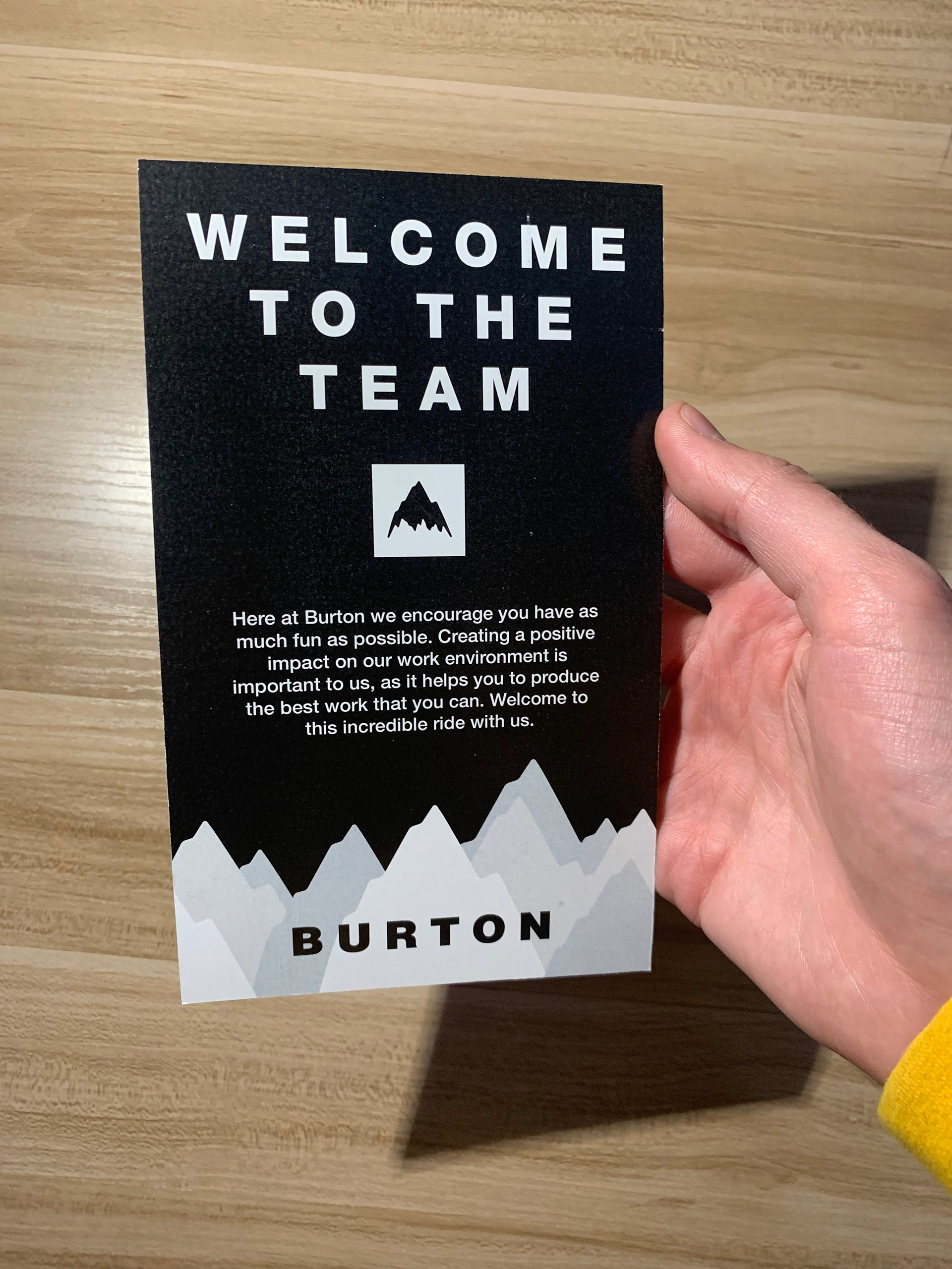
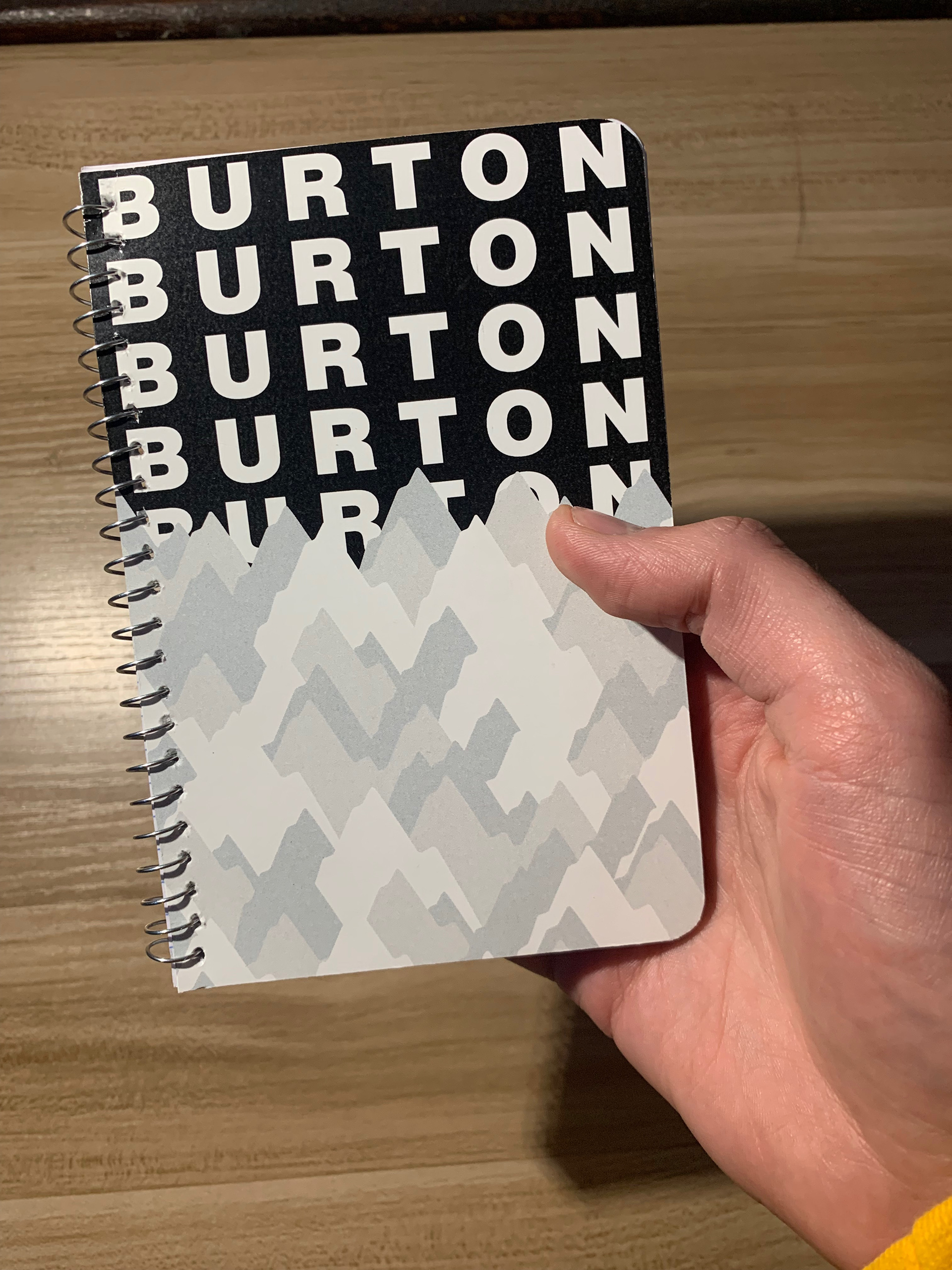
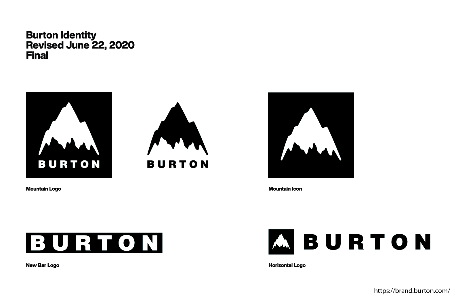
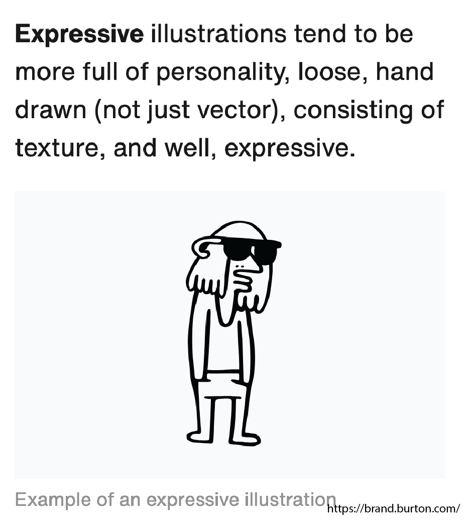
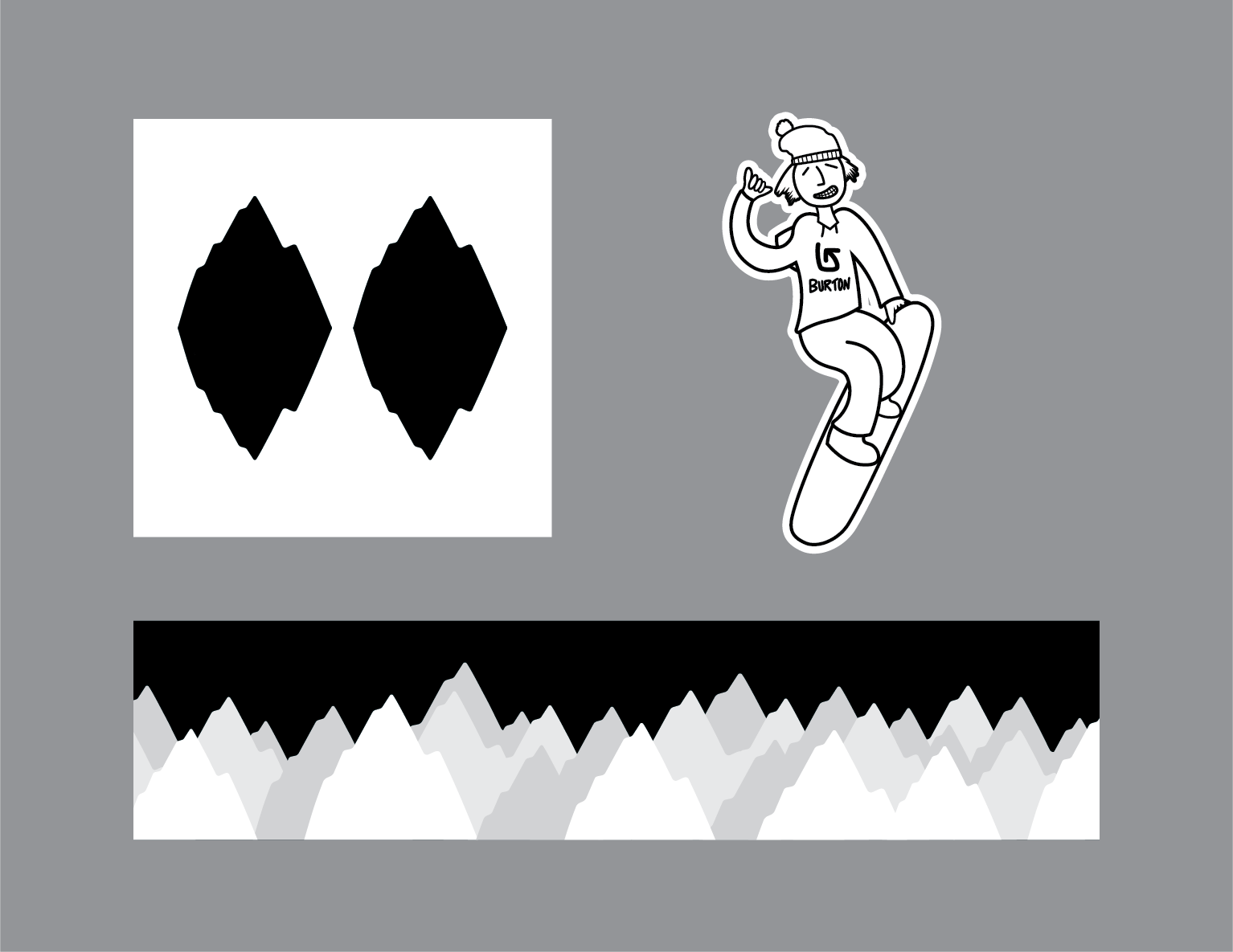
One of the main focuses for this project was to adhere to Burton's brand guidelines, in this case more specifically Burton's guidelines for its logos, colors, typography, illustration style, and brand voice. I extended the use Burton's mountain logo into the visual branding for the overall package, creating a double-black diamond and mountain range designs with it. I also created an expressive-type illustration for a few items. Using these along with Burton's set of logos created the aesthetic of the entire welcome package.
Packaging
My main idea for this welcome package was to have a ski trail sign function as the top lid of the container, but also double as a decorative. I created a double-black diamond (most difficult ski trail level) using Burton’s mountain logo to create this unique decorative. Considering Burton’s outdoor theme, and that most snowboards are made with a wooden core, I left the interior uncovered to add a natural wood accent.
Package items
I used the mountain logo and black bar logo in most of the designs, but in ways that provided a unique, fresh look. I also made sure that these logos, along with the mountain range design and illustration, were used in more than just one item, so that the package as a whole has a more cohesive overall look. I wanted the welcome card to be on top of the other items, so that the receiver would see it first upon opening. To extend the wooden idea from the welcome package interior, I also created a wooden keychain in the shape of a snowboard.
