marketing by design
DESIGN
Packaging
TYPE
Client work (Employment)
DELIVERABLES
Packaging designs
THE CLIENTs
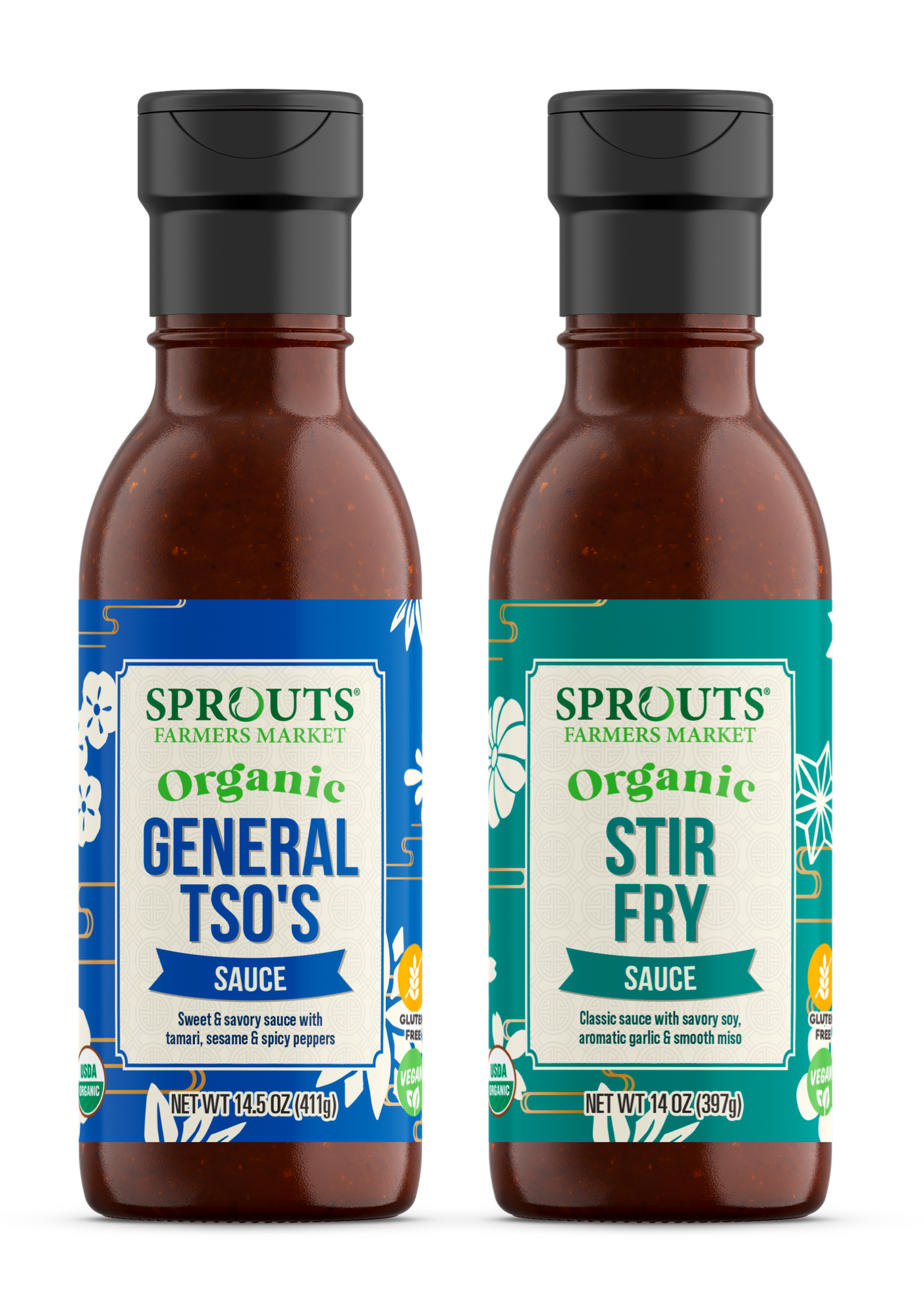
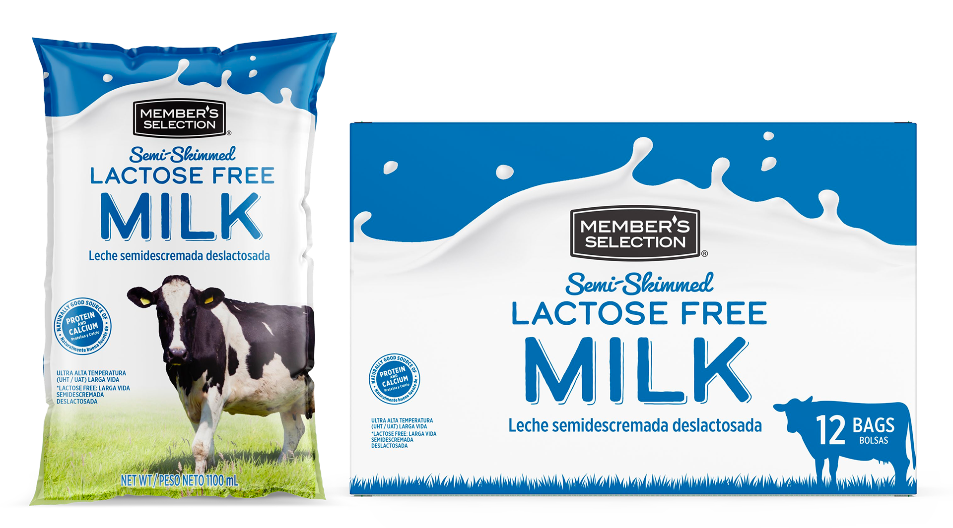
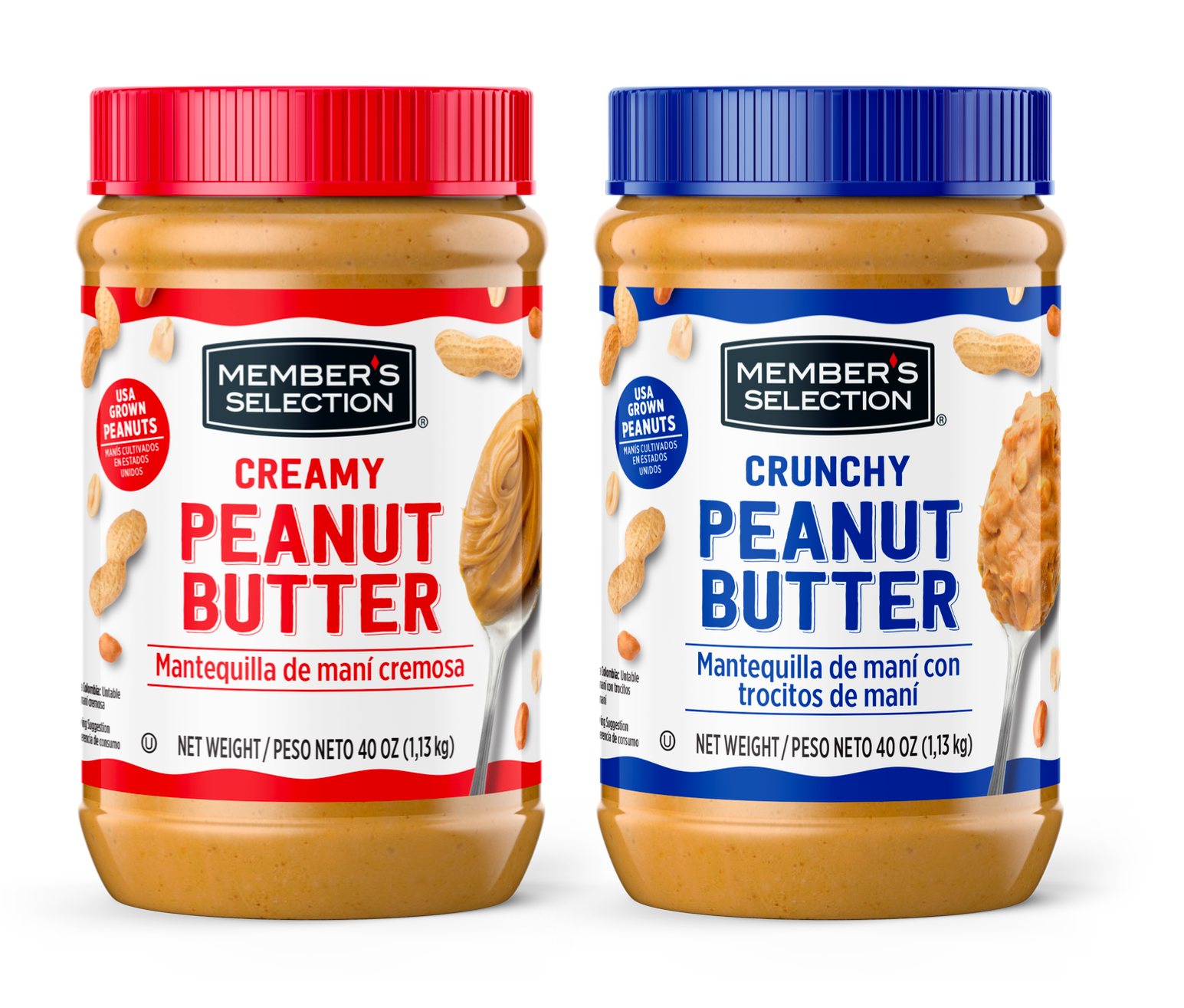
Marketing By Design (MBD) is a design company based in Beverly, MA, that focuses on packaging design. I have been employed with them since the start of 2023, almost entirely doing packaging design. I have worked with a variety of clients, mostly with 7-Eleven (Seven-Select brand), but also Sprouts supermarket, PriceSmart (Member Selection brand), BJ's (Wellsley Farms brand), and more.
Below are a few featured projects that I have detailed out, and then a collection of some more work that I created. I want to note that most, but not all, of the designs shown here were selected to go into production, but out of those many were still liked by the client.
7-Eleven - Fusion energy drink
7-Eleven had the idea for creating an energy drink that would stand out as its own sub-brand to their Seven Select brand. The main points to address were to create a dynamic look to communicate energy and movement, to highlight ingredients and qualities, and to communicate the narrative idea they had for the drink. The main inspiration they had for the design was Celsius energy drinks, and although they wanted to have it look close to Celsius at first, they later went on to move away from this idea (after this concept was created).
For my concept, I took all of these ideas in stride. I created a kind of logo for the sub-brand, adding "boosted" into the tagline to start the conversation about it being more than just an energy drink. I then used the icon from the logo as the background, giving the product a dynamic look while subtly suggesting a "fusion" of elements. This piece is also used to call out the flavor profile, suggesting a fusion of flavors as well. Additionally, the striped shape of the icon nods to the shape of Seven Select's own striped branding (featured in "More 7-Eleven projects" below). The fonts are sporty and futuristic, but simplistic, to show the cutting-edge drink idea that Fusion represents, and to be energetic and legible. A white background brings the product closer to Celsius' look, and small bubbles bring out some of the aluminum color and shine to add some visual depth, and to nod to the carbonation. Important callouts are featured in aluminum pieces as well, similarly to Celsius. The side of the can features the ingredients narrative, which I presented in an easy-to-follow way, adding pops of color for visual interest.
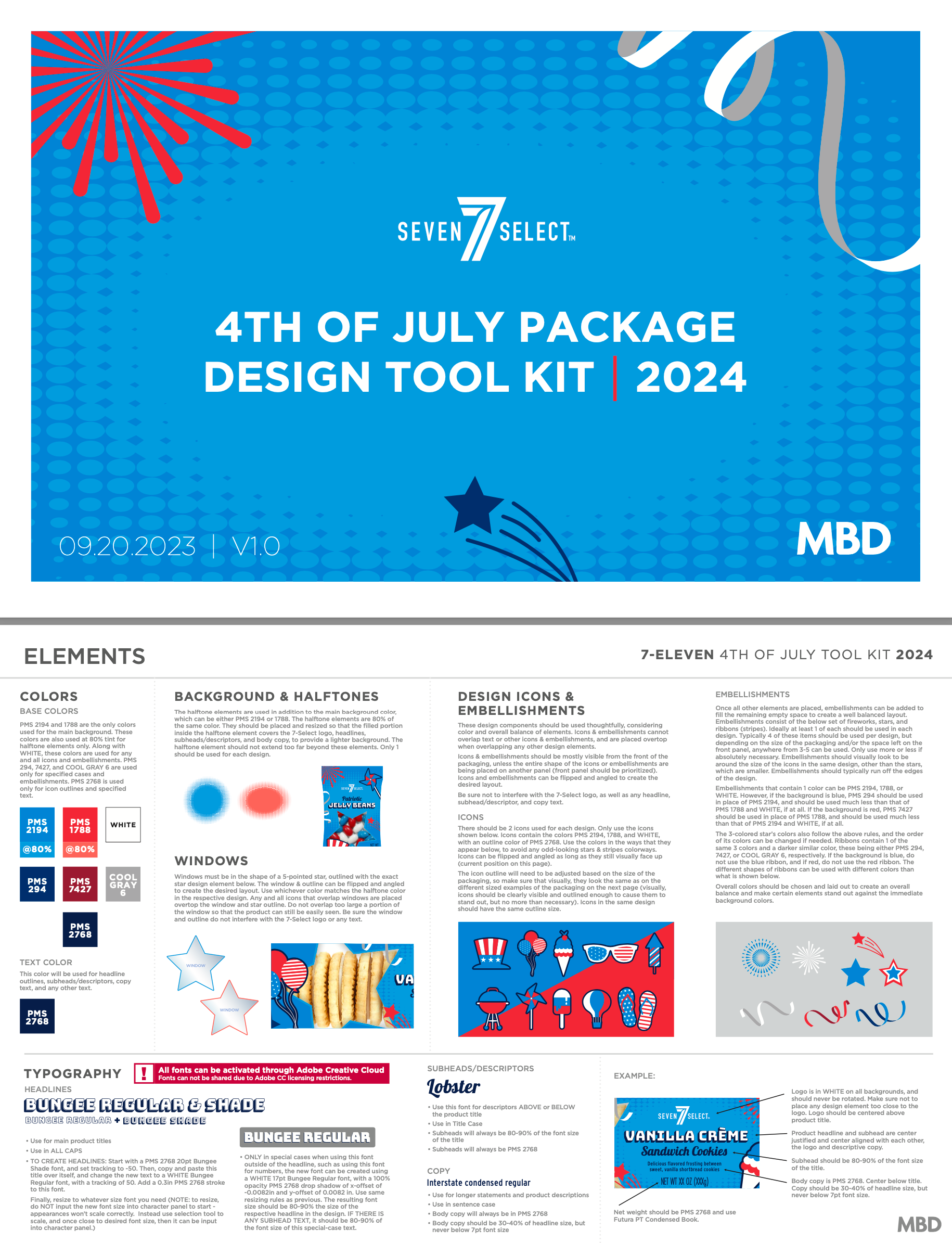
7-Eleven - 4th of july toolkit
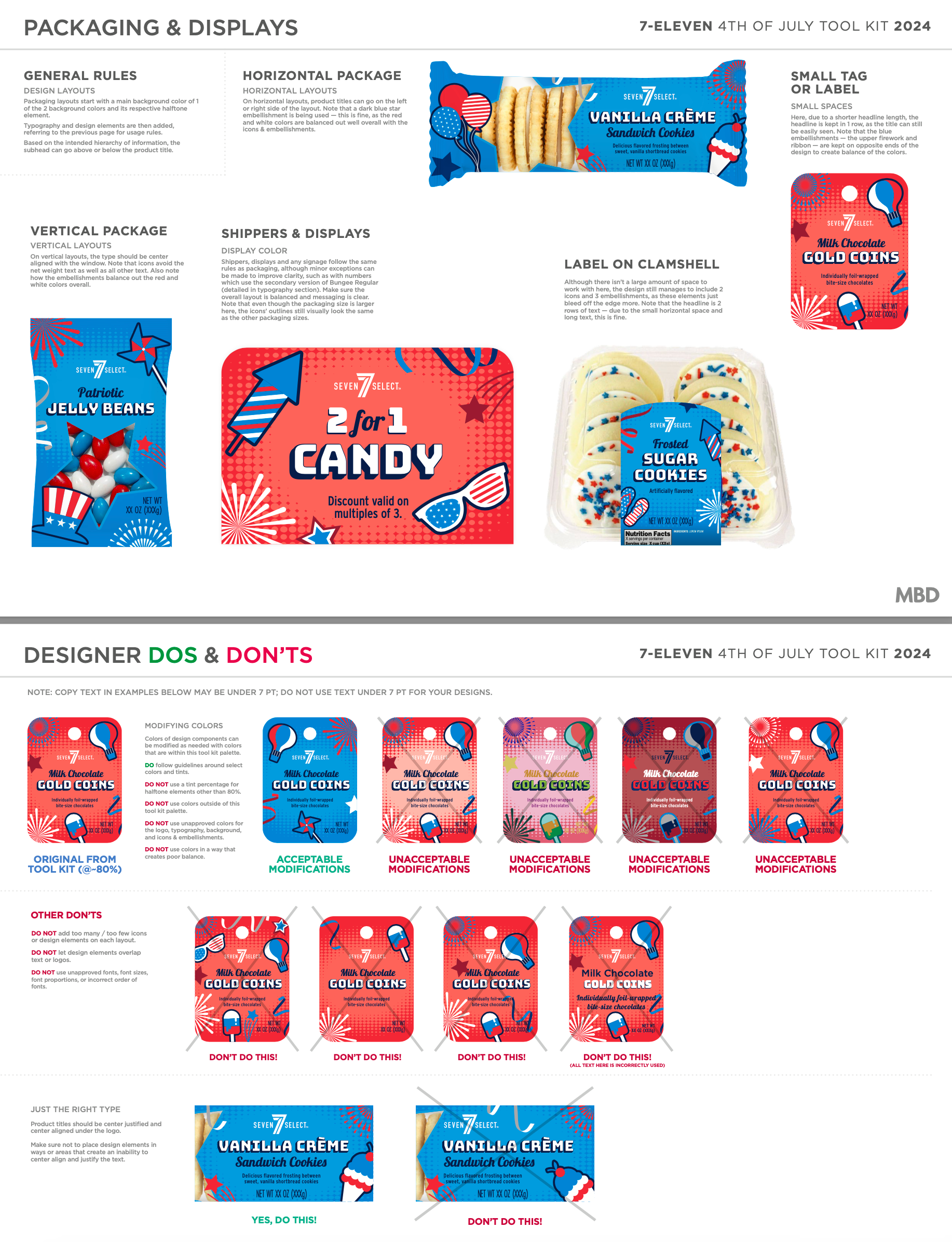
7-Eleven has themed packaging in stores for certain holidays and seasons, one of which being for the 4th of July. MBD creates design toolkits for these, which 7-Eleven can provide to their vendors as a packaging design resource. Overall this includes creating visual examples to follow, along with detailing out how the colors, fonts, backgrounds, product windows, and icons & embellishments are utilized (consistent with all toolkits).
For this toolkit I decided to go with a bit of a retro look, while still being simplistic and energetic to appeal with the current generation. For my colors, it was obvious to use reds, whites, and blues, but the particular ones I used allow for each of the colors to stand out, or allow certain pieces to stand out when necessary, resulting in bright, energetic, but legible designs. My fonts were chosen to give the designs a retro, classic Americana look, while being legible enough to stand out among the bright designs. The background for all utilizes a halftone oval, leaning into the retro look, while hinting at the visual of fireworks. It is subtle enough to allow for icons and text to take the spotlight, while also allowing for the text to be a bit more visually separated from the surrounding elements. For the embellishments, I used fireworks, stars, and streamers (hinting at stripes), which add visual interest to the designs without being as overpowering as the icons. The icons feature various symbols and objects associated with the holiday, but only a few are used on each design to avoid being too busy and emphasize a consistent look across the board. The product windows are stars, which are simple enough as to not take away from the surrounding design.
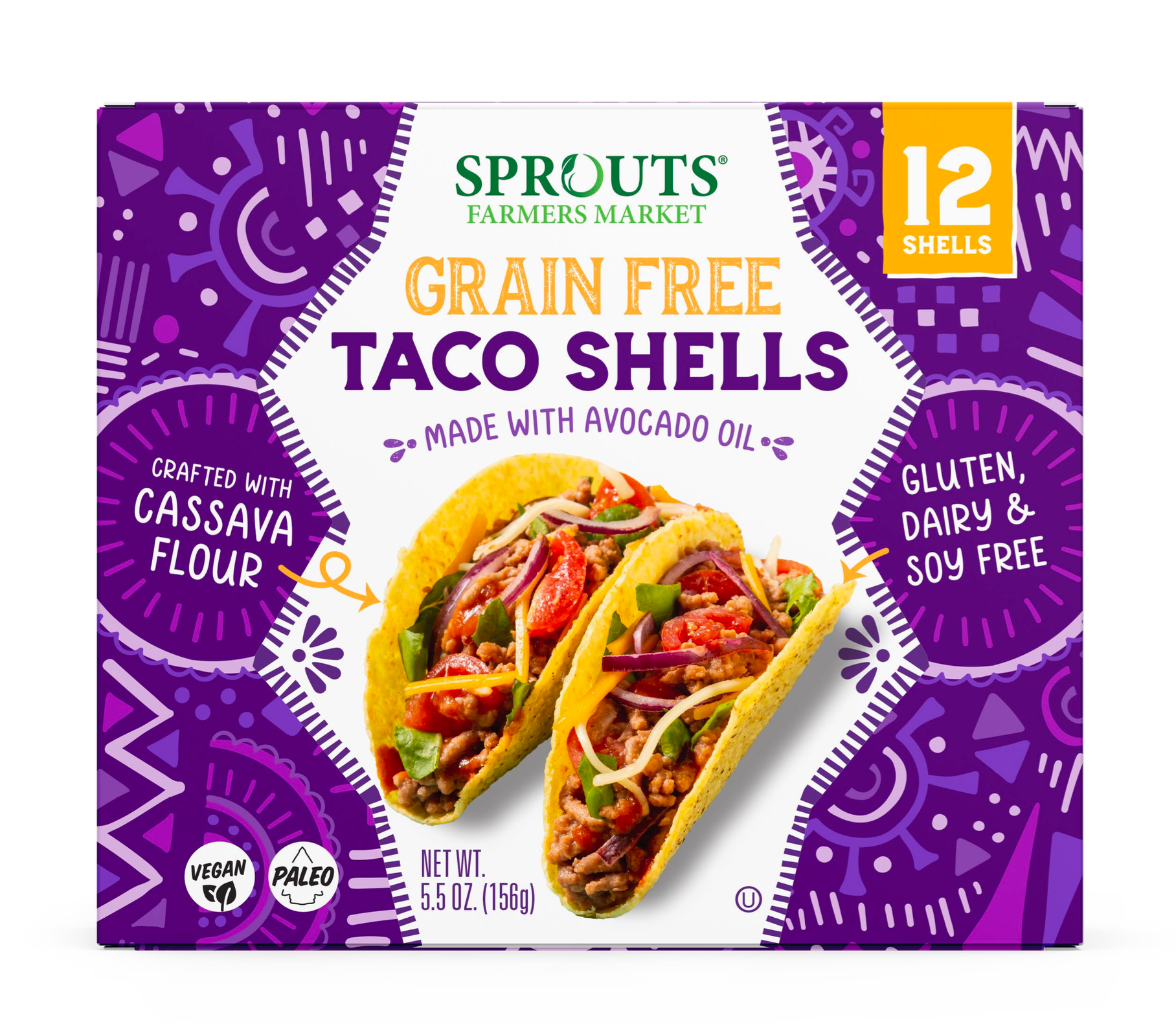
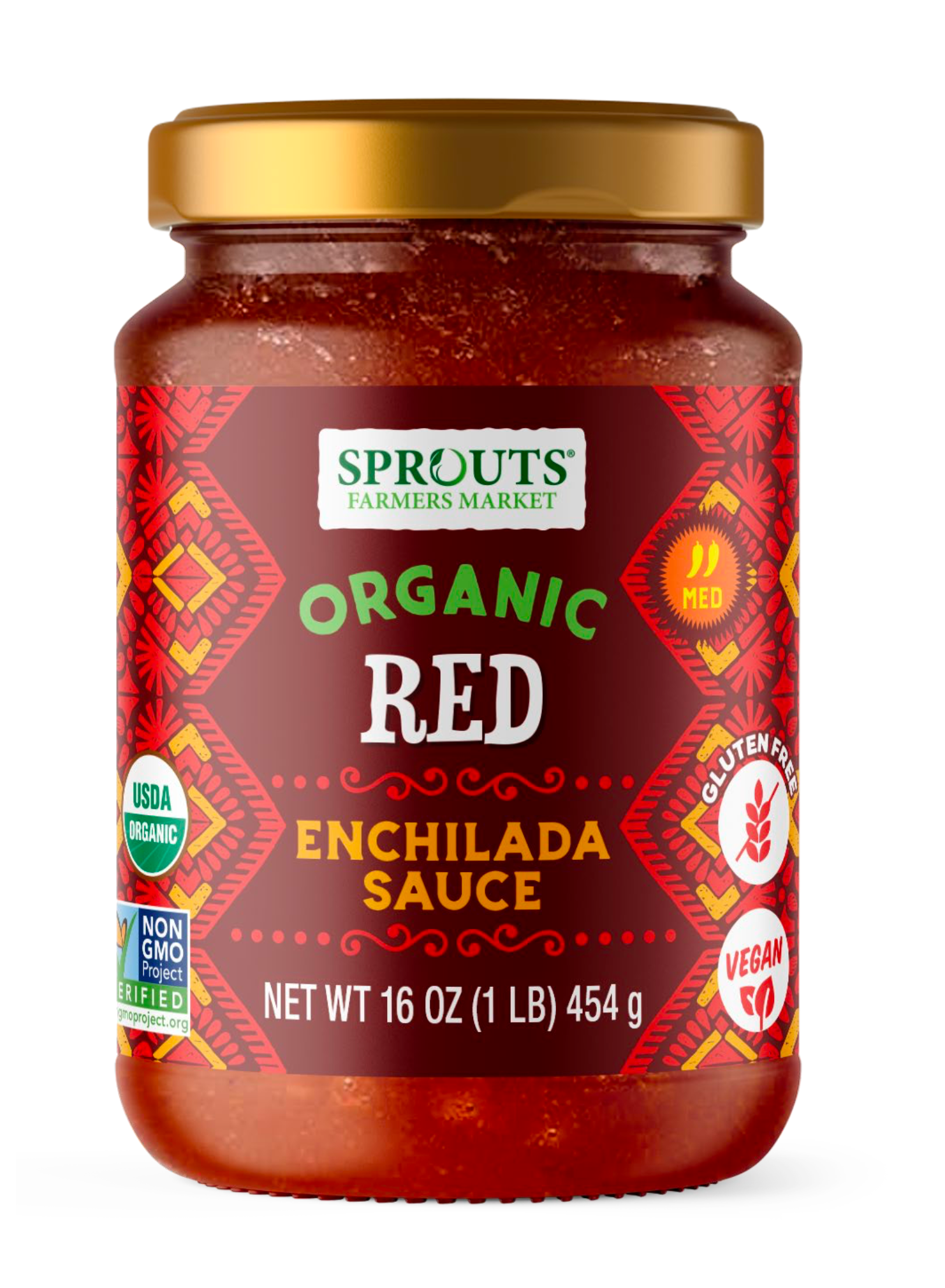
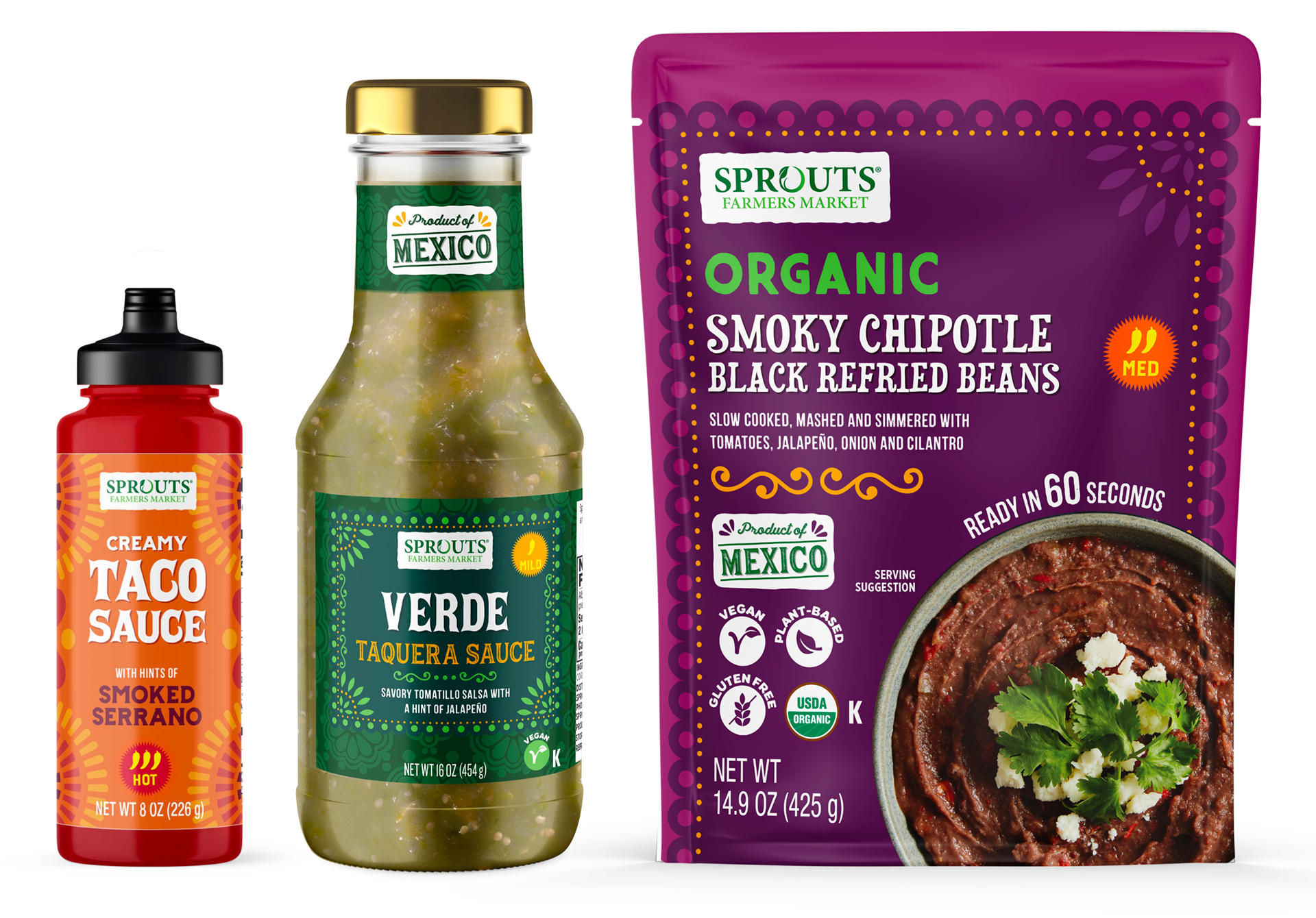
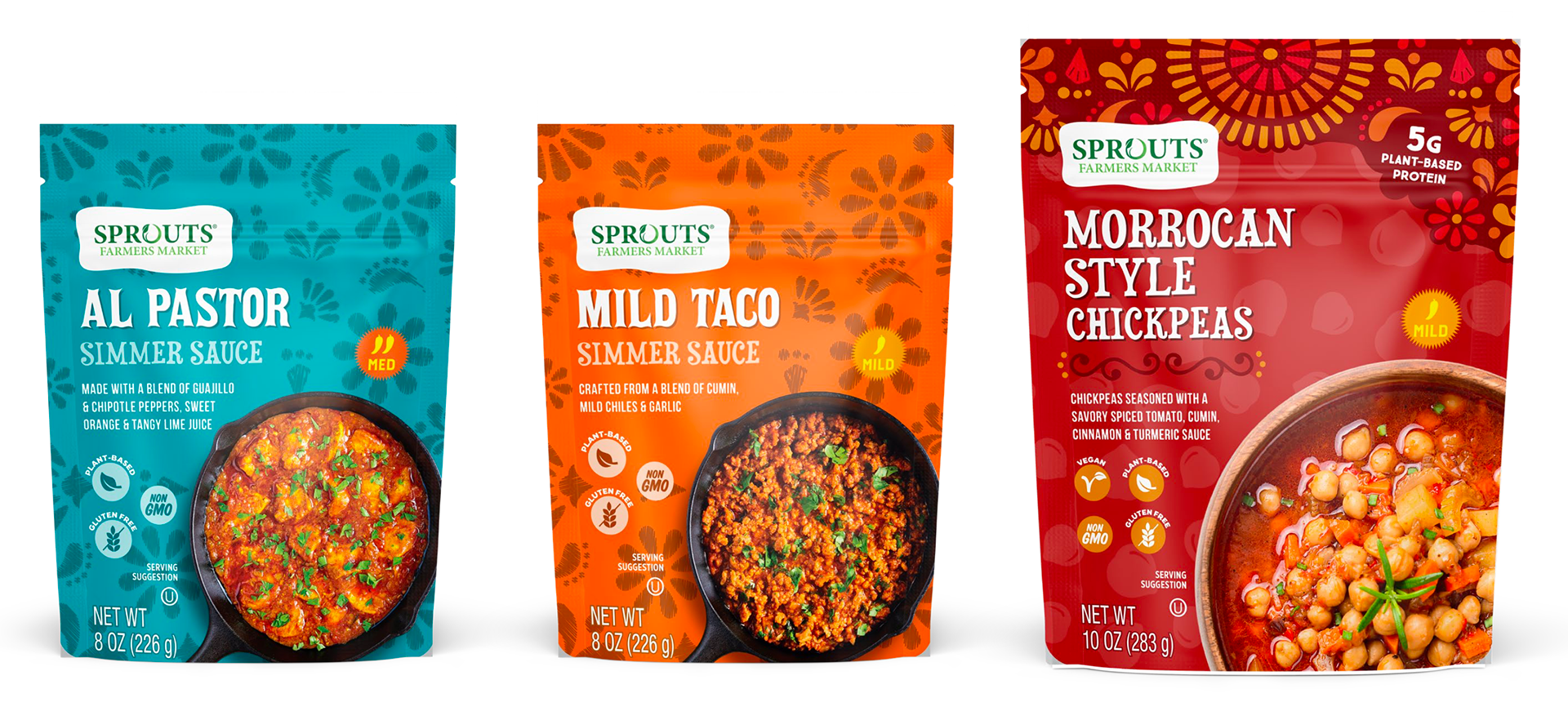
Sprouts - mexican-line projects
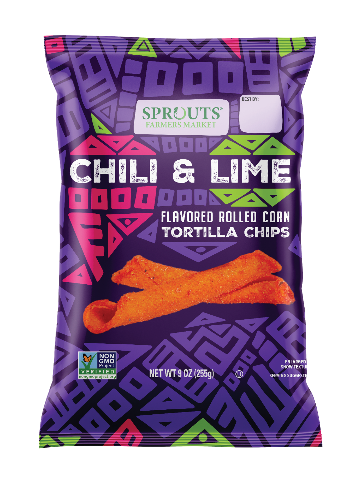
For all products that fall under their Mexican-themed line, Sprouts looks for a somewhat similar look, which on our end consists of implementing a handful of similar-styled fonts, patterns and elements for these designs. Other than this, as long as the result is a fun, quirky, but clean packaging design, then it fits in with Sprouts' overall aesthetic.
Looking over the examples I have here, you can see that some fonts, patterns, and elements are used in multiple designs. The challenge with these is to still create a unique enough design for every product, while maintaining that strategy. With the taco shells, the white strip going through the middle provides a more unique look, and the text on either side calls out important information in a fun and charming way, as well as keeping the imagery the main focus. The enchilada sauce has a more simplistic design, but still features an intriguing pattern while maintaining legibility for the text. The taquera sauce and organic beans pack needed to have a more premium aesthetic, so I created a simpler overall look while adding in elements used in other Mexican designs to create a fancy-looking border. The chickpeas at the bottom use the same chickpea background pattern as another Sprouts chickpea product, but to tie in the Mexican feel, I added a fun pattern at the top along with a few other elements.
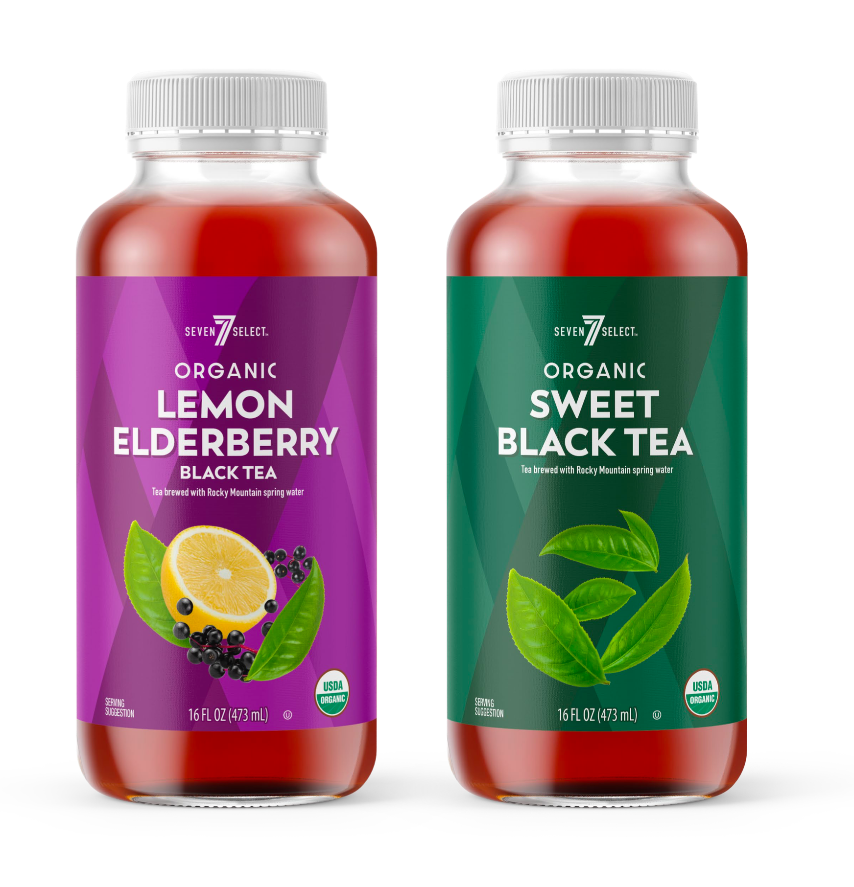
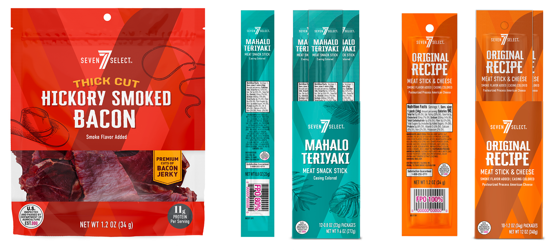
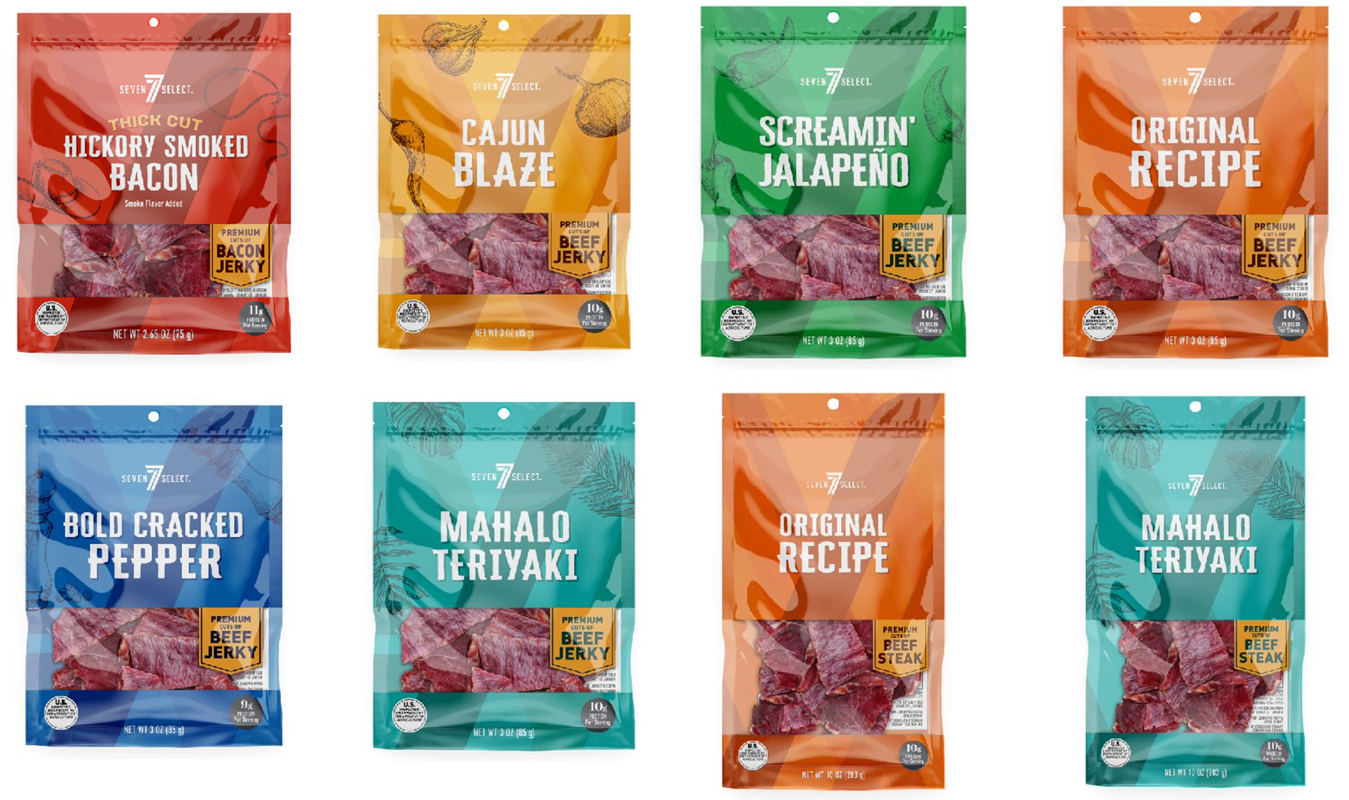
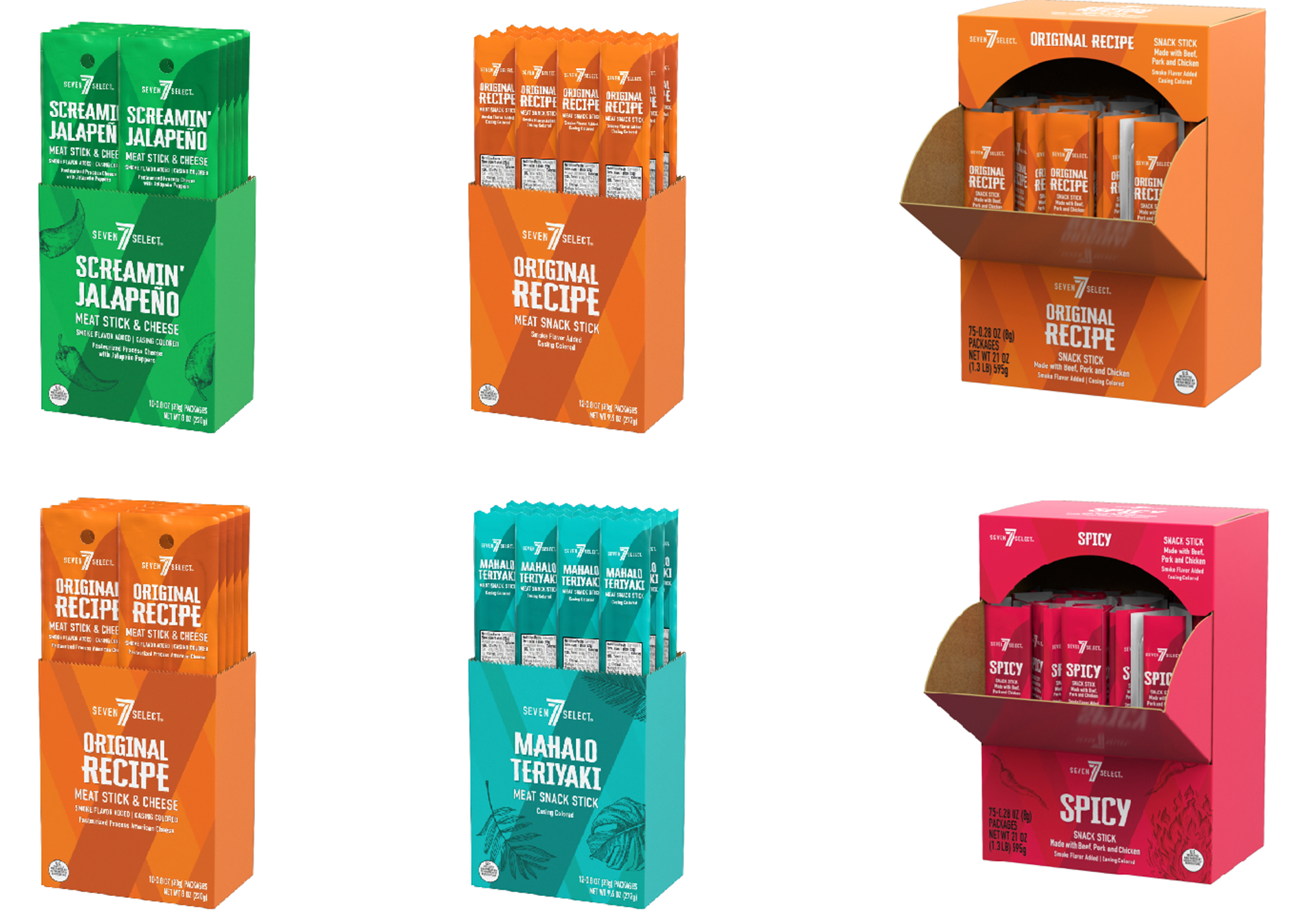
more 7-eleven projects
more misc. projects
