appointmint
DESIGN
Logo
TYPE
Client work
DELIVERABLES
Brand logo
THE CLIENT
Appointmint was an idea for an app that would keep track of all of your appointments in one place, as well as providing other useful appointment-related services.
LOGO & BRANDING
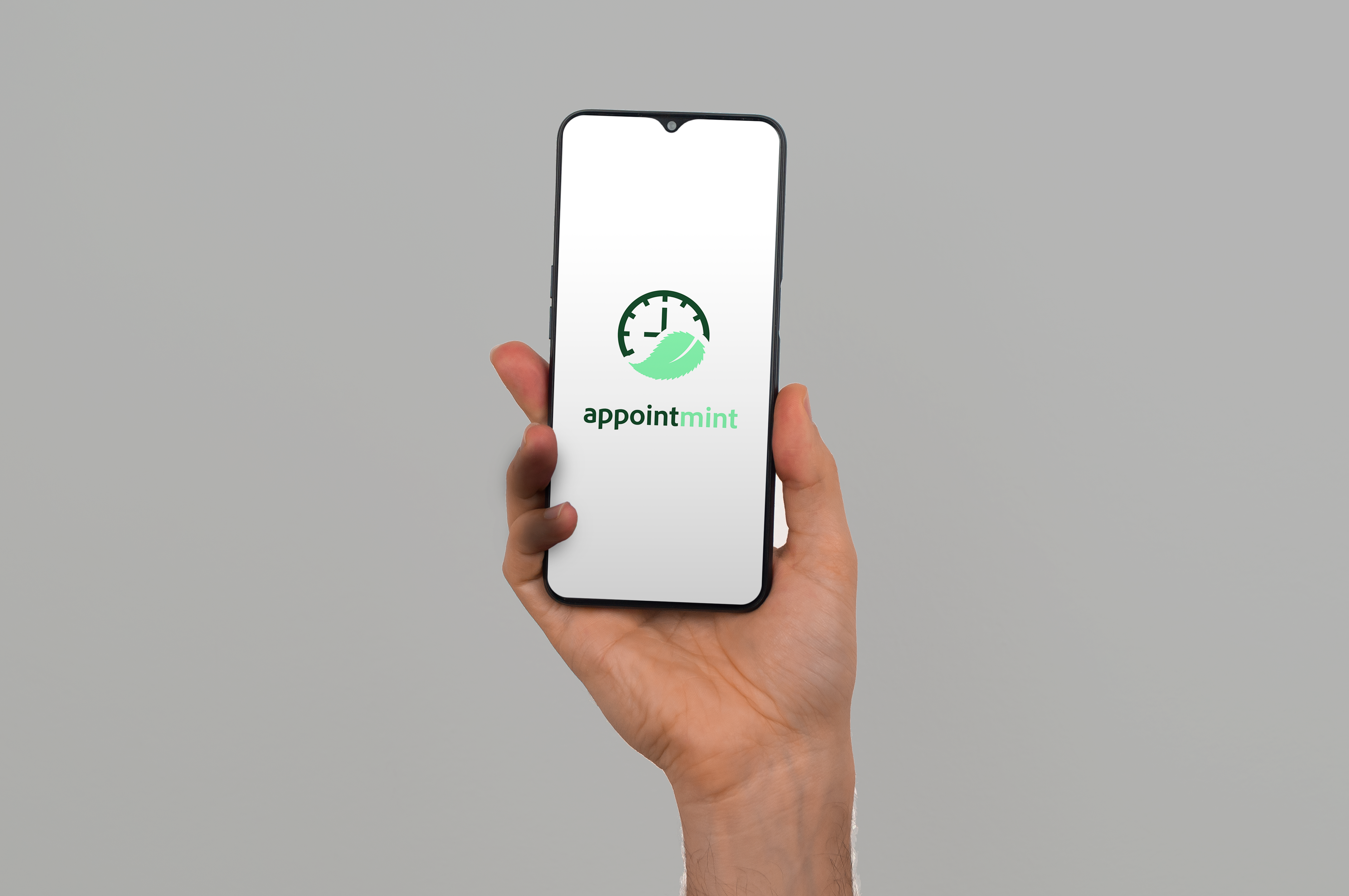
As a mobile app that would focus on providing certain functions, rather than marketing to a personality or lifestyle, it was sensible to make the logo for Appointmint literal and simplistic. Especially for a small, more-unknown brand, a more direct-representation logo would work better than a more abstract logo that established brands can get away with.
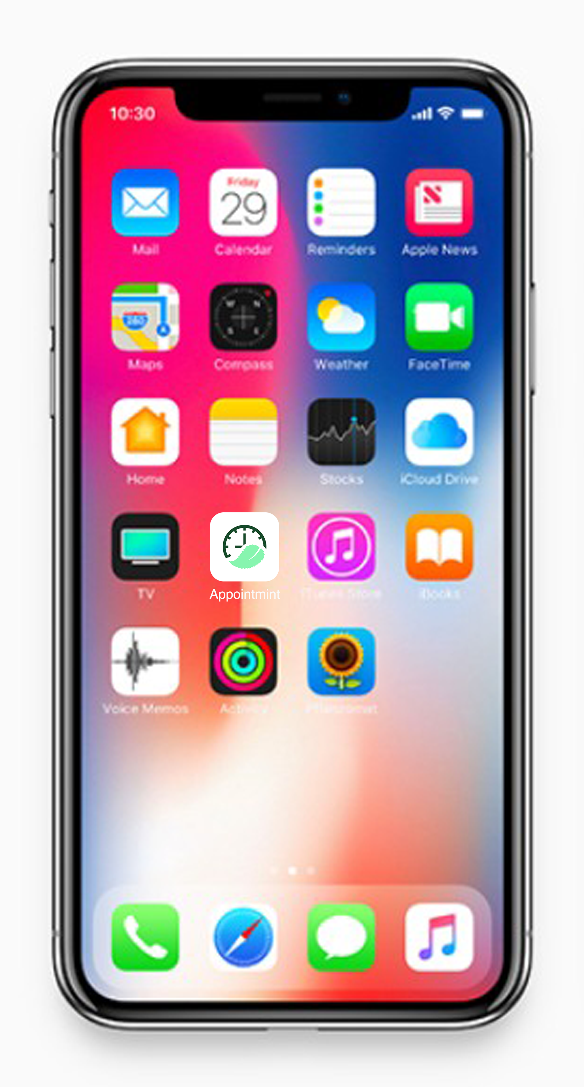
In the case of the logo I produced, the clock represents the appointment aspect, as they deal with time. The clock's hands display a specific time (this is additionally pronounced by having a rigid angle of the clock's hands) to suggest the aspect of scheduling appointments at a specific time. The rigid angle also works to suggest a more literal function, rather than a personality.
That being said, the colors, font, and mint leaf all offer unique characteristics that allow the logo to have a distinct look, and convey the usefulness of the app. The mint leaf wrapped underneath the clock, as if it were holding it up, suggests that Appointmint takes care of your appointment needs. The wordmark is kept in lowercase to further this helpful and friendly impression.


