honolulu olympics
DESIGN
Logo, Branding, Advertisement, Apparel, Print
TYPE
University project
DELIVERABLES
Olympic logo, Poster, Postcard, Ticket, Apparel product
THE IDEA
Branding for the summer Olympics taking place in Honolulu, Hawaii
LOGO & BRANDING
Since Honolulu is considered the gateway to the Hawaiian Islands, and that this would be the first time Hawaii would be hosting the Olympics, I decided that Honolulu would represent Hawaii as a whole; albeit with a few aspects of the branding that relate directly to Honolulu. There were 3 main things that I wanted this project to focus on: Olympic sports, Hawaii's landscape, and its Polynesian history.
The logo itself incorporates all of these aspects: Olympic sports, as the overall icon depicts a surfer; the landscape, showing the sun over a volcano over the ocean; and Hawaii's Polynesian history, brought forth in the use of an enata character. There are several more references included in the logo and colors, as shown below.
I also used a pattern inspired by the Polynesian culture’s tattoos, and a white background color which is a staple of olympic branding but also works to let the featured colors pop.
Print deliverables & apparel
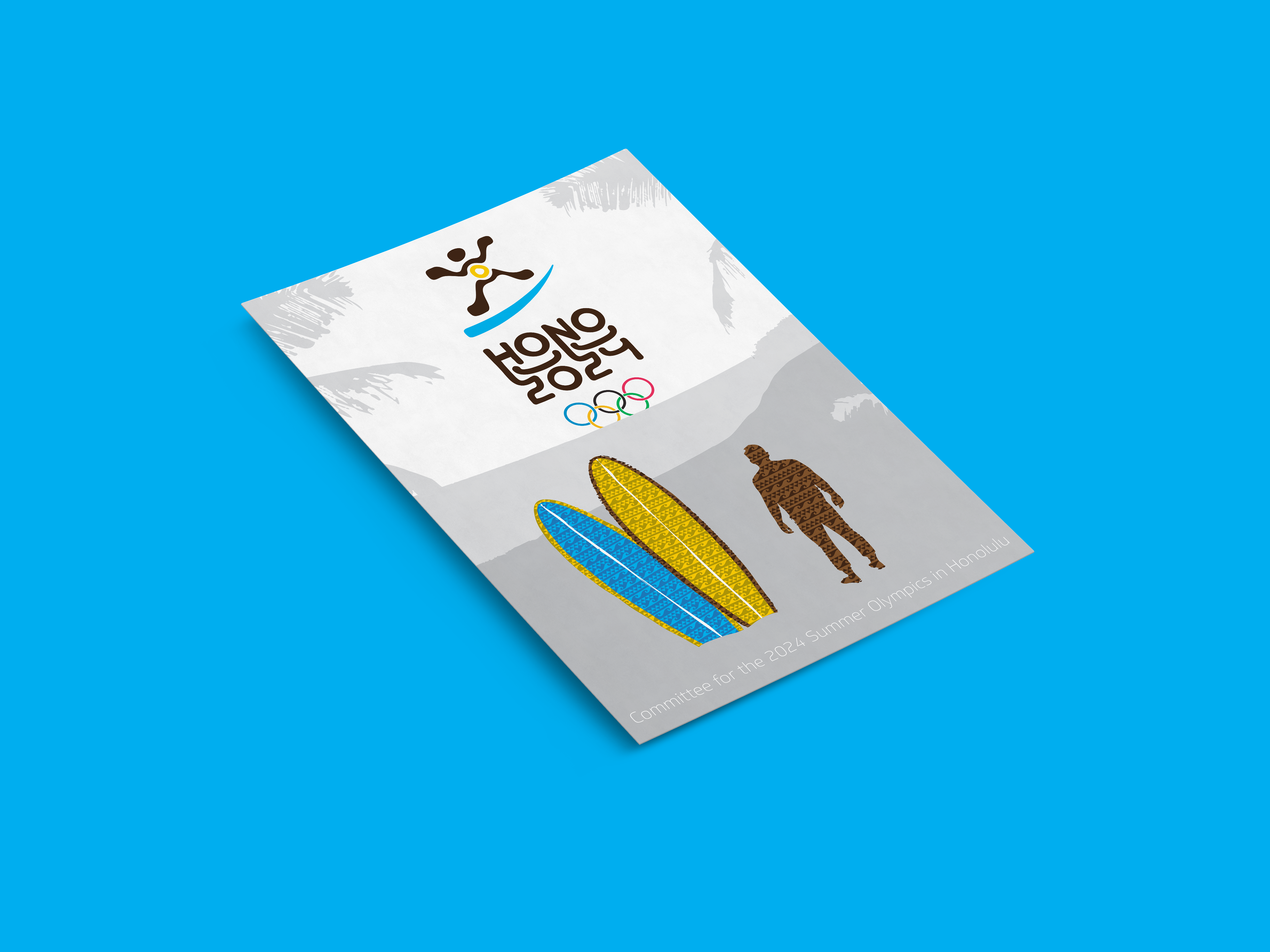
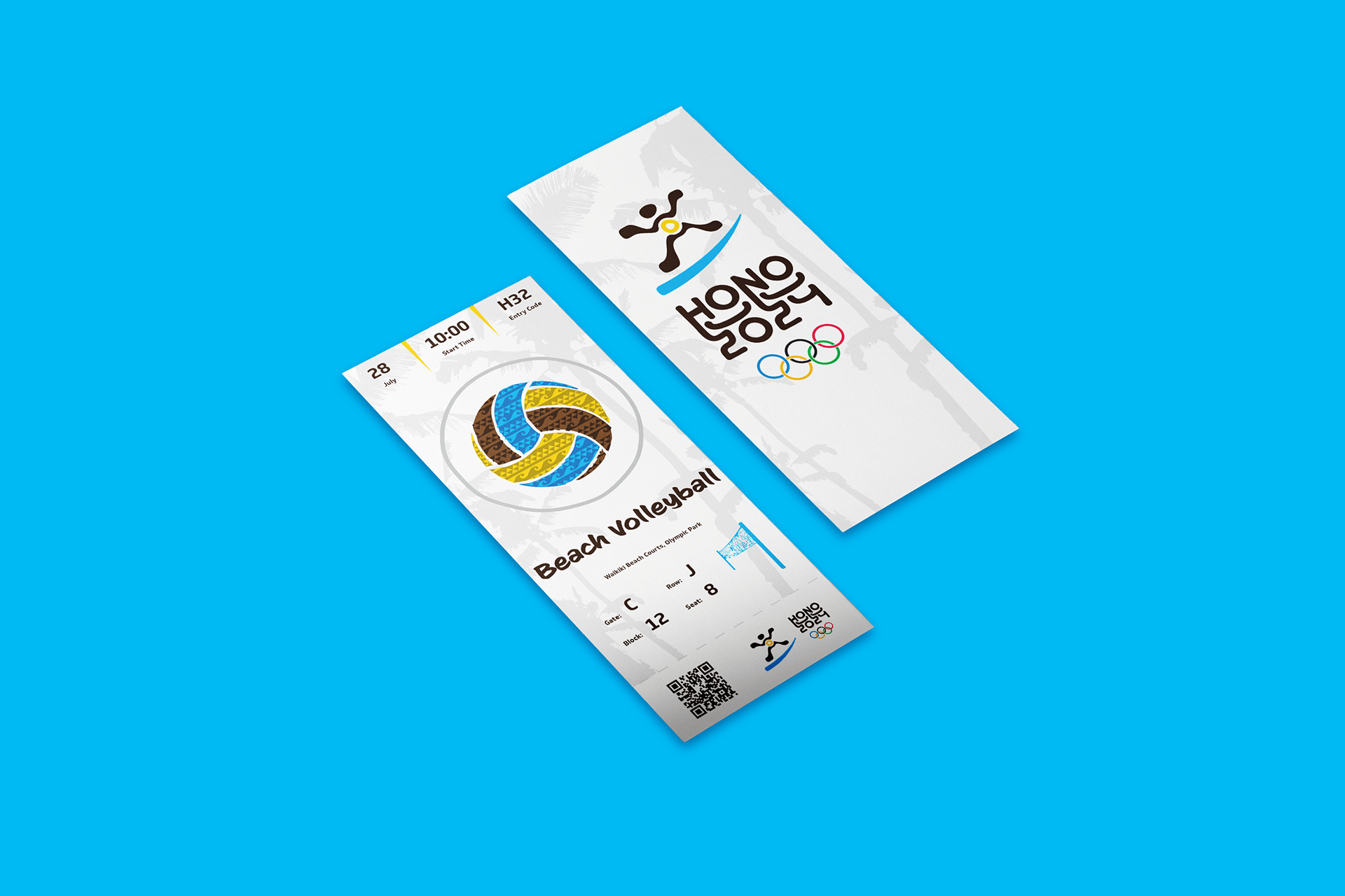
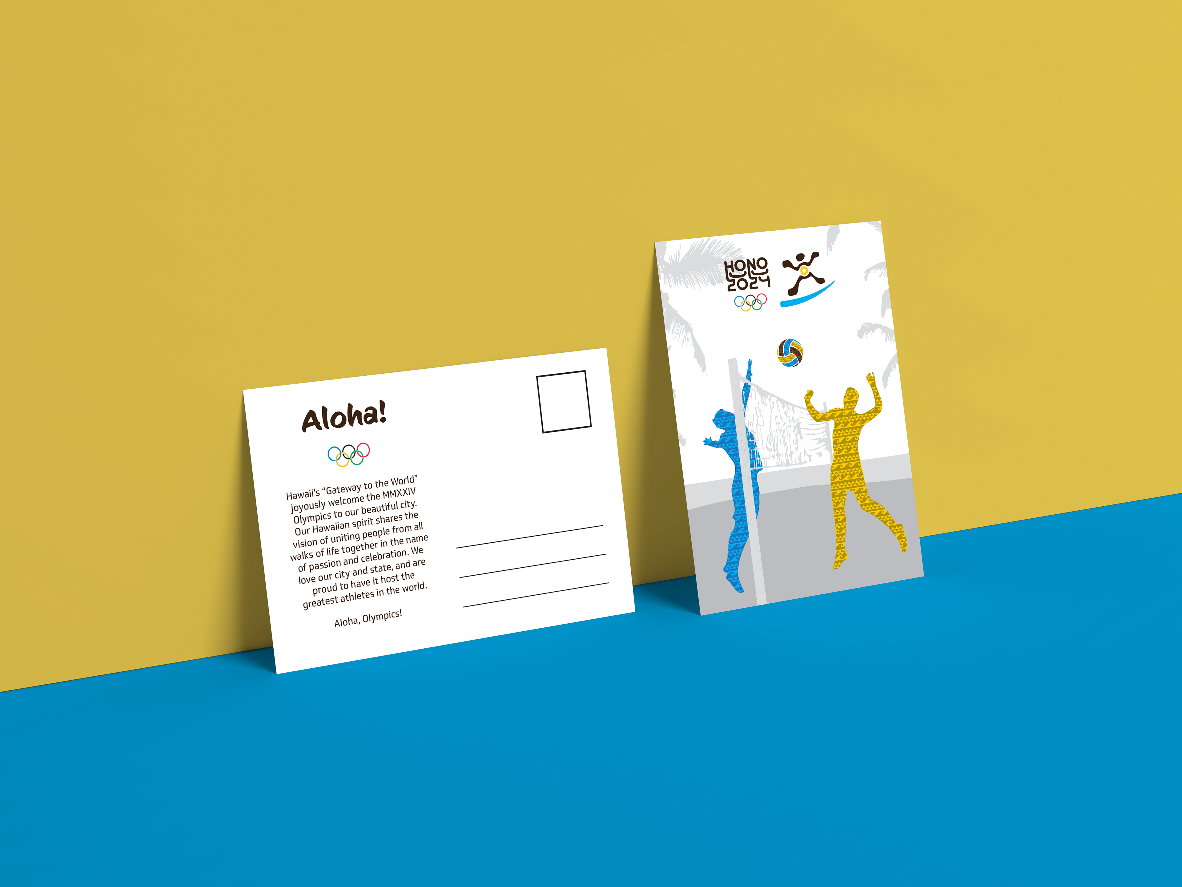
For the poster, event ticket, postcard, and hat, I utilized the pattern in the brand colors to highlight the people and sports, since that is the focus of the Olympic games. The background shows the landscape of Hawaii’s beaches, but it is kept subtle to avoid looking like tourist items. I focused on featuring water sports for my print deliverables since surfing started in Hawaii and the state is known for its beaches.


