ipaf
DESIGN
Editorial
TYPE
University project
DELIVERABLES
Annual report
THE IDEA
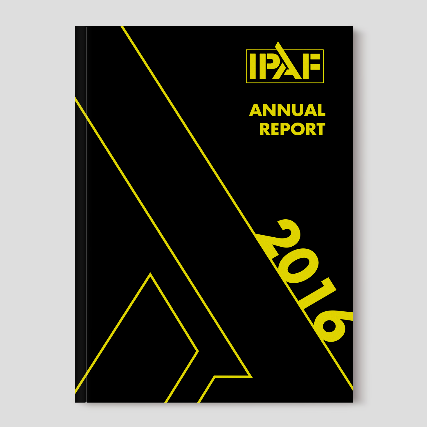
A redesign of IPAF's (International Powered Access Federation) 2016 annual report. IPAF is a non-profit organization for the industry of elevating work platforms.
BRANDING & Editorial redesign
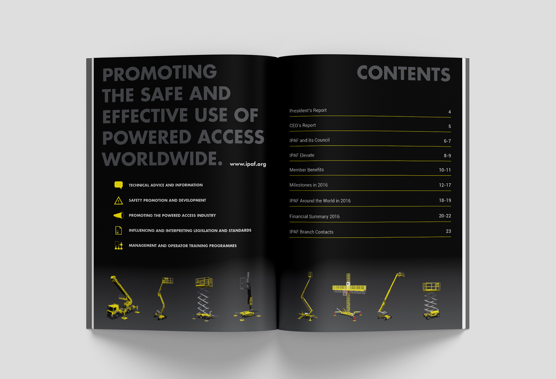
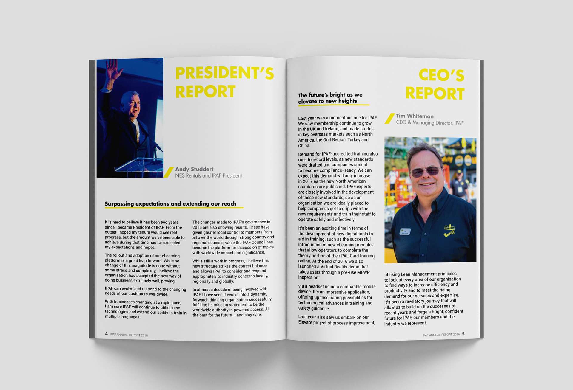
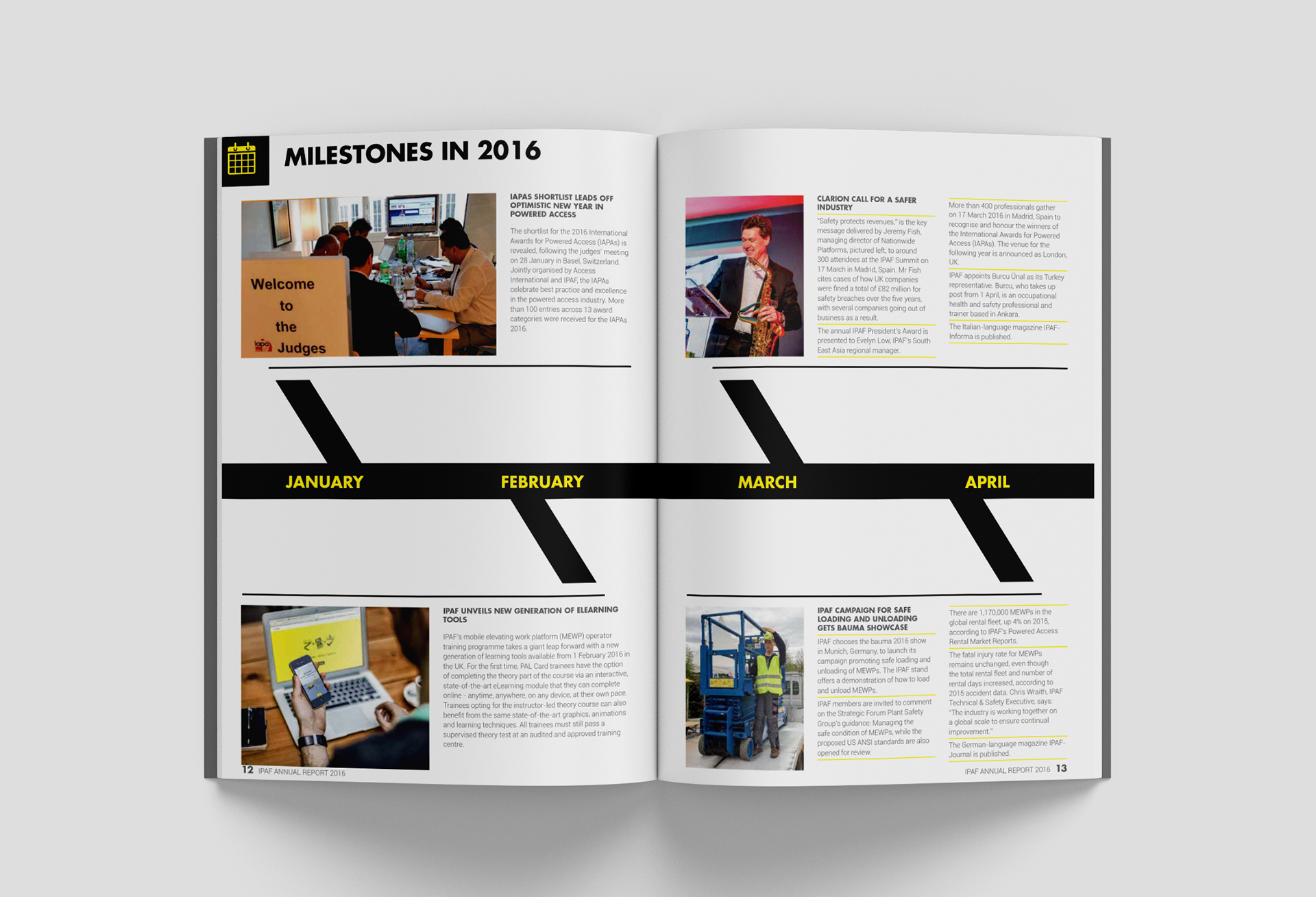
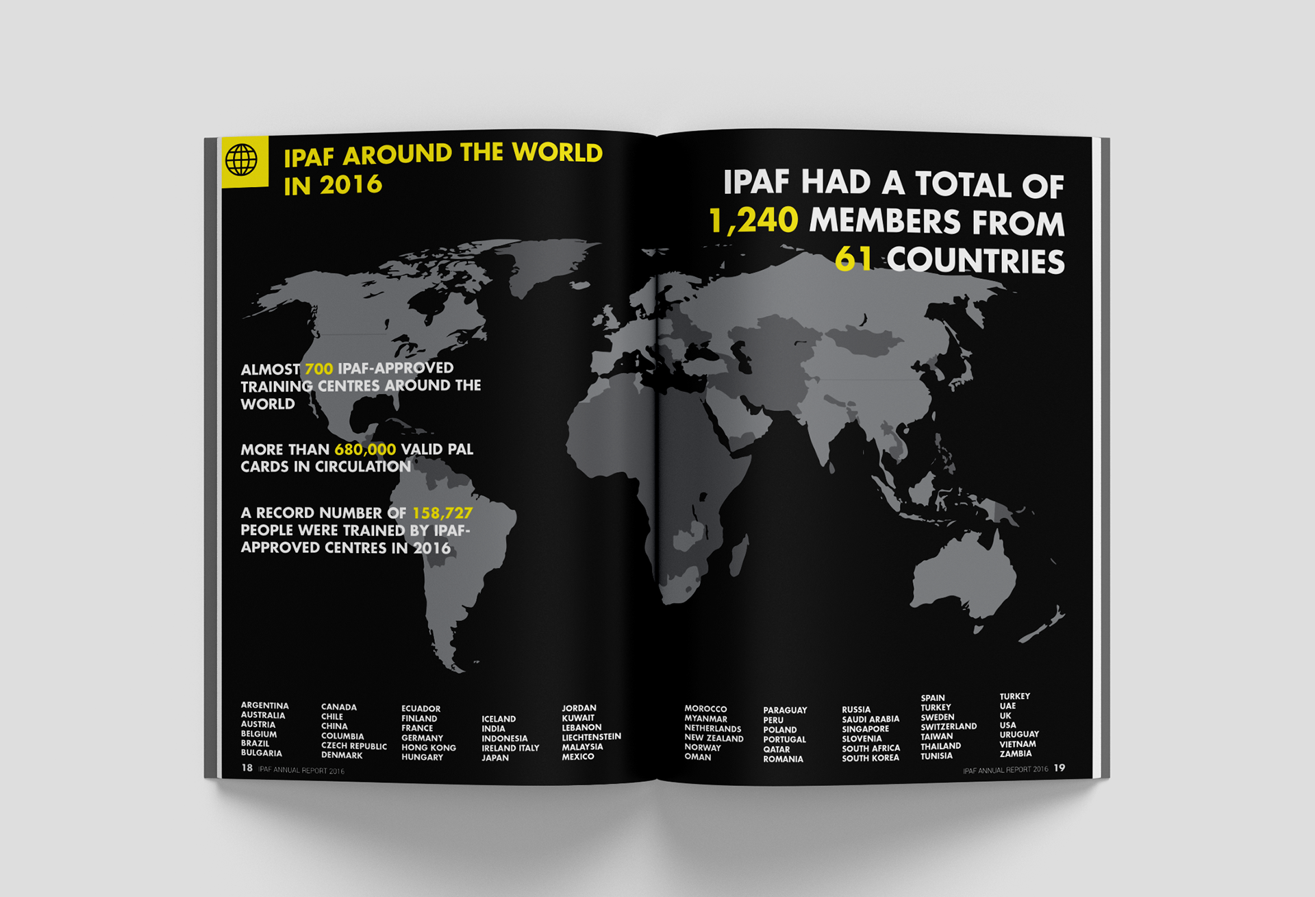
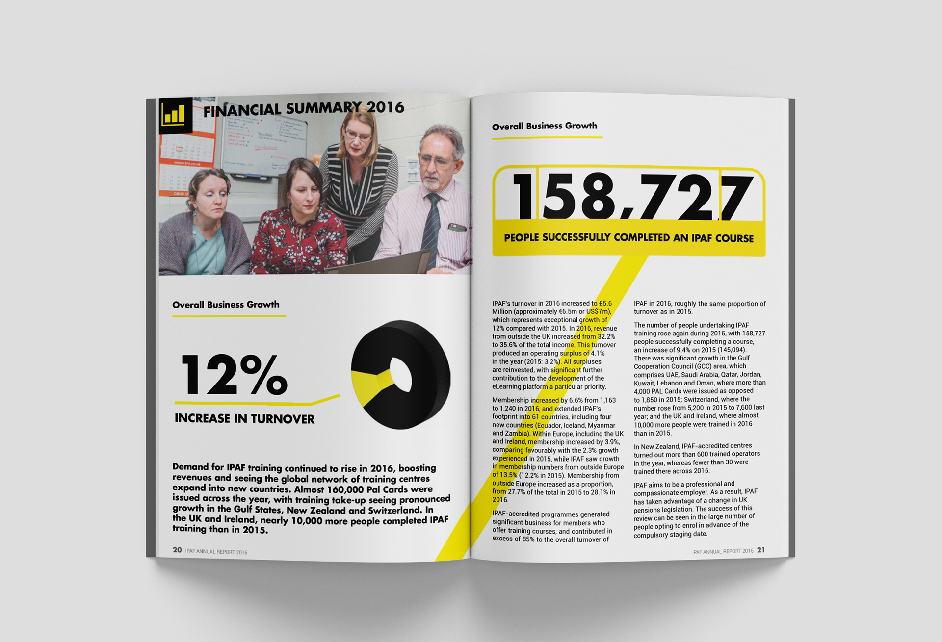
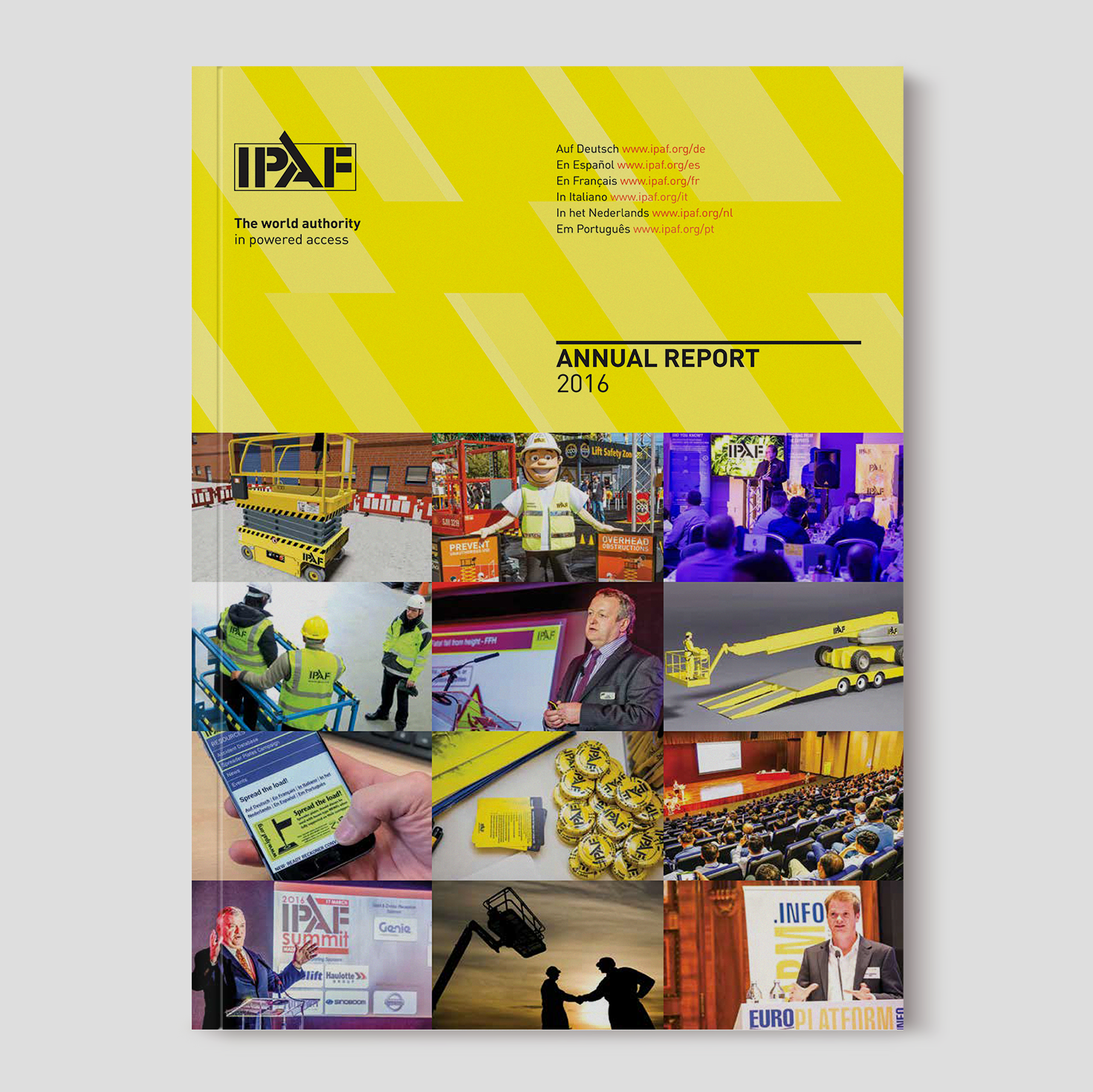
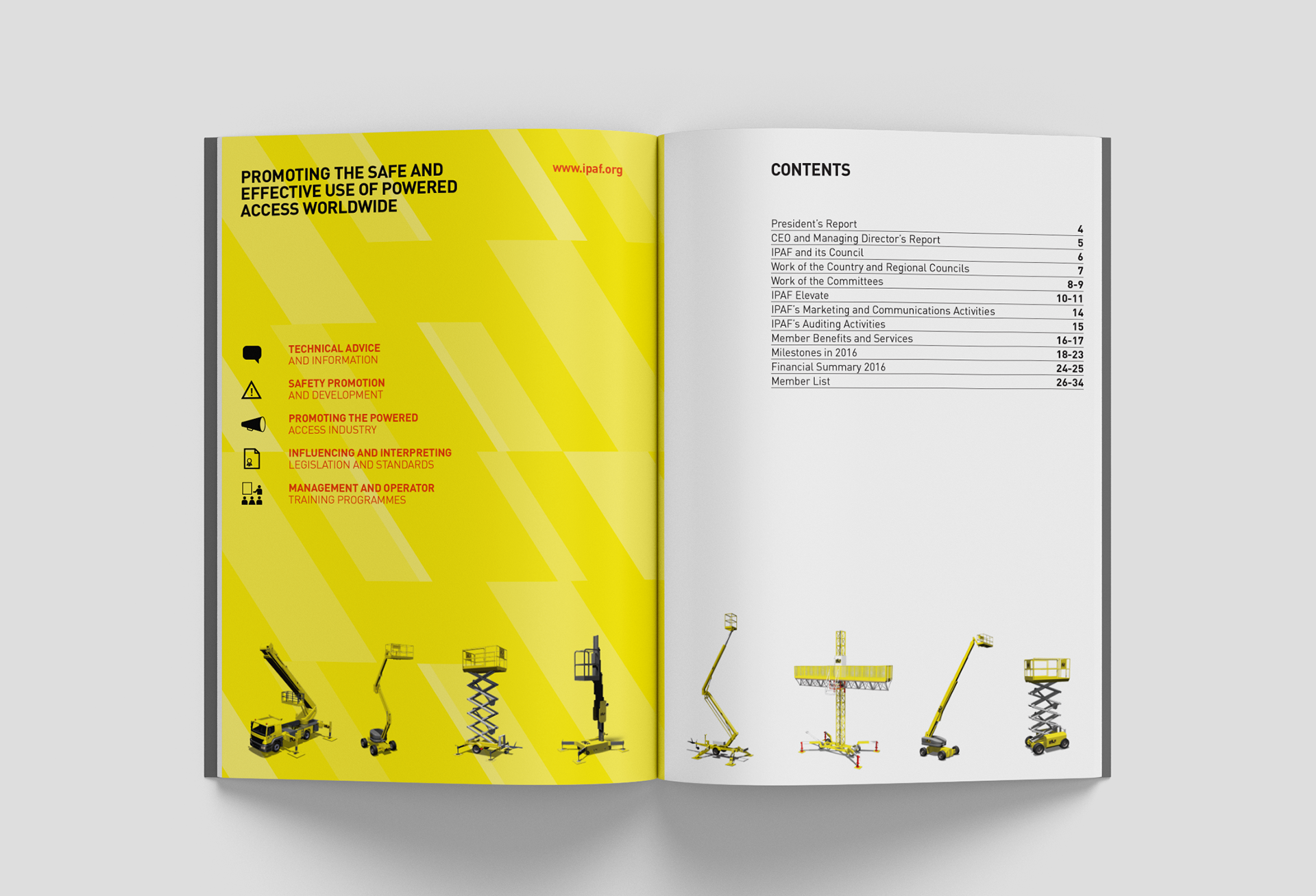
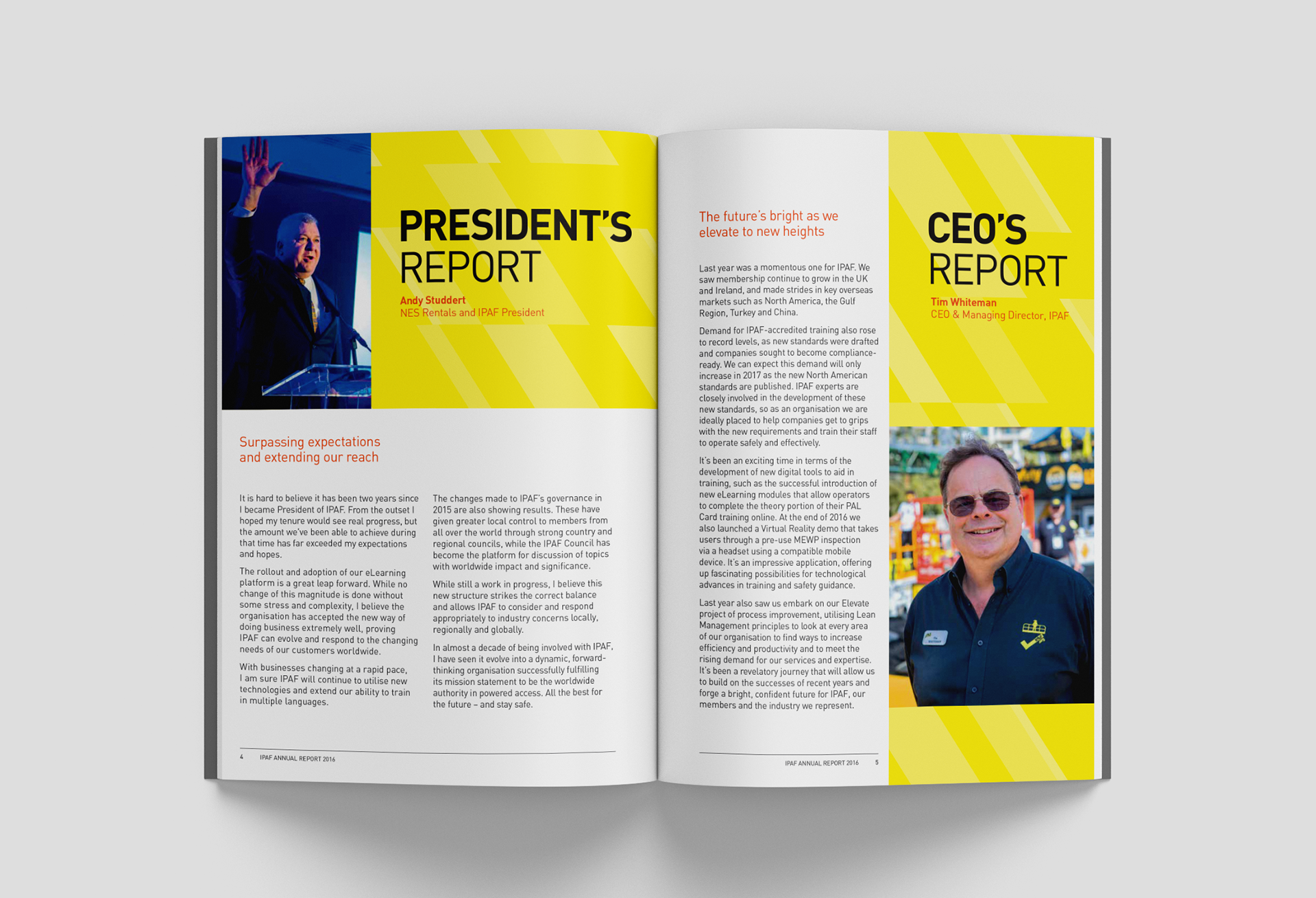
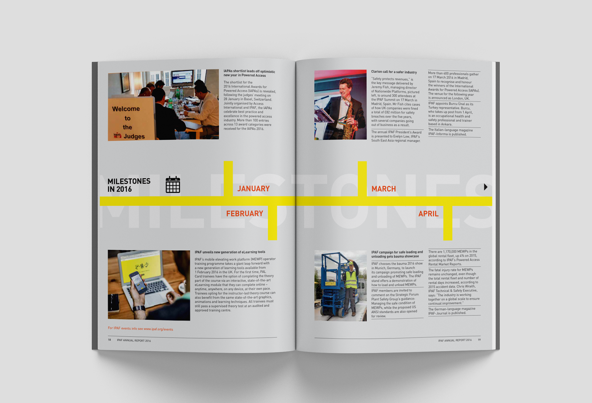
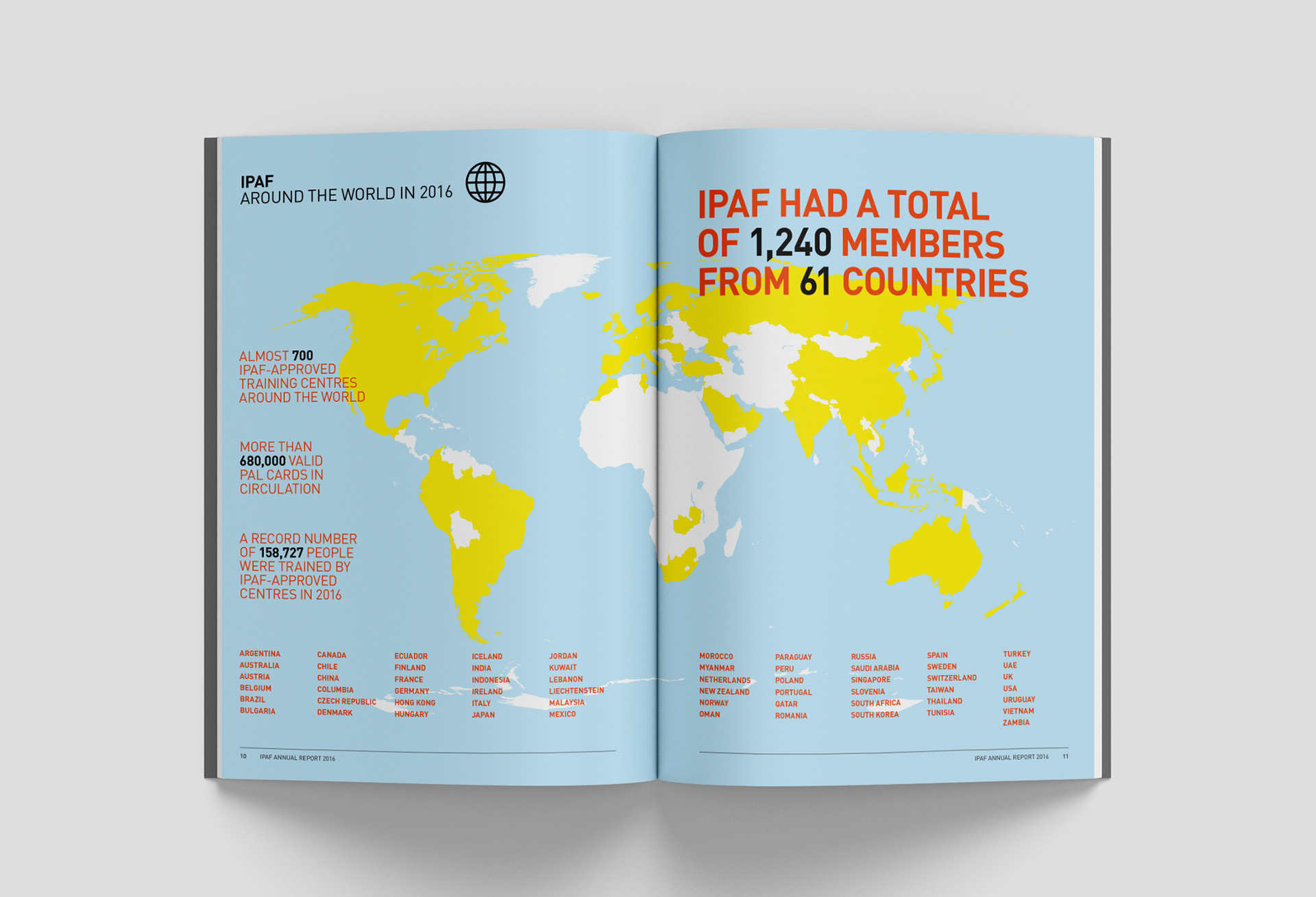
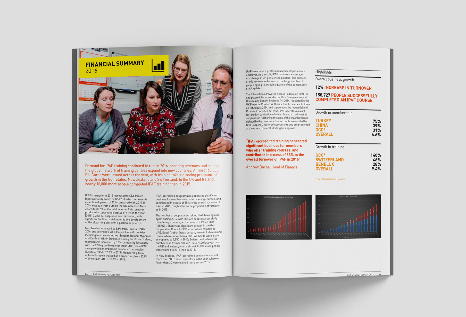
I looked to improve on the current design through either a few small changes to a page, changing the entire look of the page, or even improving on the overall brand standards. One of the main changes I had in mind was to refine the color theme. I took out the orange color completely, since it felt out of place with the other colors. I focused on using black, greys, and white, using the yellow to call attention to important parts, while still serving as the overarching theme color. I updated the fonts to Futura and Roboto, as both are modern and work well with an engineering theme. I also made use of a slanted rectangle shape in appropriate areas as a piece of visual identity, referencing construction and the slanted arms of several different elevated work platforms. I redesigned graphs that allowed the information to translate better visually, and emphasized major statistics. I also improved the symbols and page headers to look more cohesive page-to-page.
BEFORE REDESIGN
AFTER REDESIGN
